Monday, April 15th, 2019 by Julian Karsunky
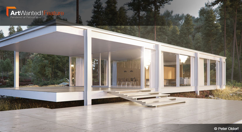
Those familiar with Mies van der Rohe’s iconic Farnsworth House might immediately spot that something is off in Peter Oldorf’s reimagined scene. Not satisfied with simple 3D reconstruction, the German archviz artist decided to unceremoniously transplant the building from its original location in Plato, Illinois to a rugged Swedish forest landscape.
Check out our interview to find out what inspired this bold move, as Peter talks about his latest piece, his history in architectural visualization and his assessment of the current state of VR technology.
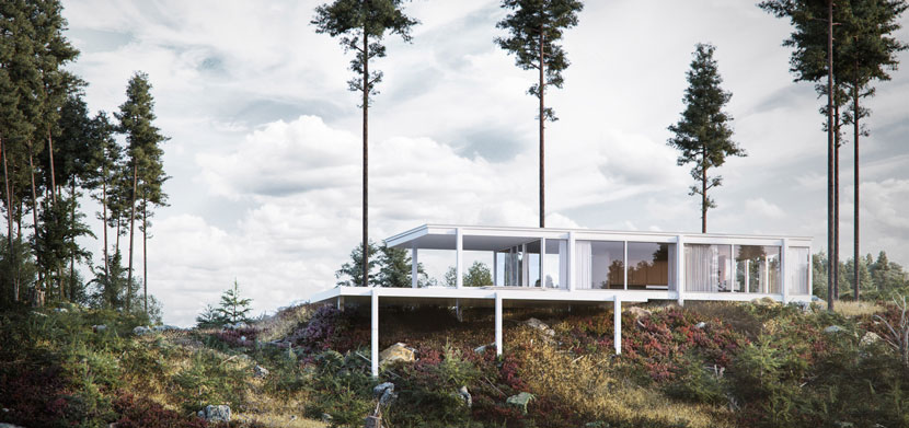 To fit the Farnsworth House into this uneven landscape, Peter had to further elevate the building, effectively turning the terrace into a balcony.
Hi Peter, glad to have you! To start things off, please introduce yourself to our readers!
Hi, I’m Peter Oldorf, I’m a 31-years-old freelance 3D senior artist specialized in architectural visualization, post production, environment design and VR development. I’m originally from Rostock, Germany, but I’ve been living in Hamburg for about 10 years now.
Do you recall when and how you first consciously encountered CGI?
Not counting the Sindbad stop motion movies, my first real contact with CGI was ‘Jurassic Park’. However, my own hands-on experience with 3D software came much later: first in 2006, when I was studying graphic design in Rostock, and once again during my 2008 internship at lichtecht, a high end archviz studio based in Hamburg.
When and why did you then decide to pursue a professional career as a 3D artist?
I’ve always loved creating things. After working with V-Ray and 3ds Max, I soon recognized the possibilities of 3D. Basically, it gives you the opportunity to take anything in your mind and bring it to life. Furthermore, I liked the prospect of going down a path that might eventually lead to a job with a lot of creative freedom and flexibility, while also allowing me to pay rent.
What training or education do you have?
My basic software knowledge comes from good colleges and my work experiences at lichtecht and bloomimages. Besides that, I’ve learned a lot from artist friends, blogs and, of course, online tutorials. I’ll never stop learning and always try to push myself a bit further. It’s hard to keep up with all the brilliant artists out there, but it’s fun at the same time as well as an endless source of inspiration.
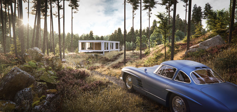 ‘Farnsworth House’, alternate angle. Car credit: Kapitan kakao
How did you end up specializing in architectural visualization?
In my five years working at lichtecht, I learned a lot about archviz techniques, was involved in many exciting projects, and as a team, we always tried to push the quality with new plugins, render software and scripts. I took a liking to the challenge of creating an organic, living world around a nonliving structure. Also, I like being involved in all the steps. Building the architecture, finding the right lighting, setting the right camera view and bringing it all together in Photoshop is a complex and satisfying workflow.
What is your current job situation? Are you employed at the moment or exclusively working freelance?
I’ve been working freelance since 2014, but right now all my energy goes into vriction, our company. We founded vriction around two years ago and we’re very happy to see it grow.
Can you tell us more about this company of yours? What services does vriction provide?
vriction is a unique digital agency in the fields of architecture, interior design and app development. We create digital worlds and bring them to life. Our work is heavily accompanied by a comprehensive visual support structure. Amongst others, this entails 3D animation, visualization, VR, AR, and 3D printing. This allows our clients to see and experience our ideas and designs in a multitude of ways before they are realized. We call it “virtual construction”.
What are your target markets and who are your clients?
We mainly work for property developers, advertising companies and single brands such as Walter Knoll, Kloeber, Cappellini, Thonet or Fritz Hansen. We also develop Apps and create 3D visuals for the real estate, automotive, and fashion related industries.
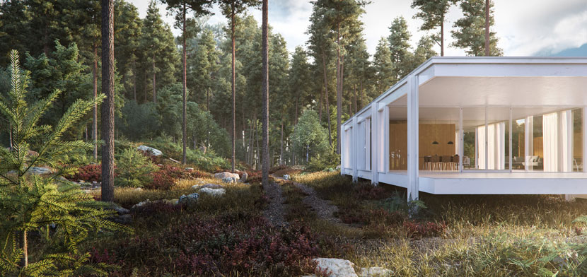 This angle offers a glimpse into the interior of the famous Farnsworth House, which appears to be a single open room. For Peter, the lush and diverse vegetation was the more creative part of the project.
Generally speaking, what is your main goal when doing architectural visualization scenes? What is your personal standard as a studio?
I think every scene has its own unique beauty somewhere, and I always try to find it. If you are able to tell a story and find the right mood for your project, you can push the image a lot. You may even come closer to great artists like the guys over at MIR in Norway. I would say MIR’s way of bringing architecture, mood and story together is pretty much paragon of architectural visualization. It might be hard to reach that level, but it’s definitely a big inspiration for my work.
What skill set is most important in your line of work?
The most important skill set would probably be staying curious, be willing to never stop learning and always set new and higher standards for yourself. Another important thing is to connect with other artists and share your achievements. Getting criticism from people you trust helps a lot! Maybe ask a photographer about your camera angles, an architect about your setting and an expert in materials for their honest opinions.
My ‘Farnsworth House’, for example, is the direct result of the feedback I received from several sources. I even dropped half the images I had made already, which I would probably never have done on my own.
What does your usual workflow look like when working with a client?
For the most part, I try to involve the client in every step. First, we talk about the overall goal and how to achieve it. We then prepare screenshots and try out different camera views. The final image is almost always the result of a longer process, simply presenting a final rendering to a client always bears the risk of coming back with bad feedback, and then you might’ve to start all over again. This workflow also works with designs or concepts. Sometimes a good mood board at the beginning can save a lot of time in the end.
Is there a specific design philosophy or architectural school of thought you adhere to? What inspires you as a 3D artist?
I’m still learning a lot and would not say I adhere to a specific philosophy, but I think it’s a good idea to look closely to great artists, designers and architects and try to figure out what makes their work so special. Classic architecture highlights like the Farnsworth House for example are timeless and never get boring. Almost everything build today seems to be influenced by a brilliant architect or designer one way or the other. So, a look at the “old masters” can be very inspiring.
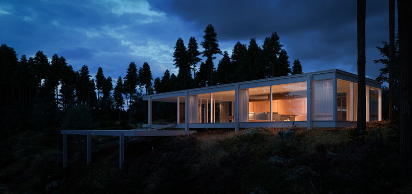 Edith Farnsworth, who had commissioned the house as a weekend retreat, has famously voiced her dissatisfaction with Mies van der Rohe’s design by saying “No one knows what it is like to live in a glass house”. Would she have felt more comfortable at Peter’s more isolate location?
Speaking of “old masters”, let us examine your submission to our ArtWanted! campaign more closely, a full CG-showcase of Mies van der Rohe’s famous Farnsworth House. Please tell us all about the project and the story behind it! How did you come up with the original idea?
While my friends and me were on holiday in Sweden, we spent a lot of time hiking through the beautiful woods. During one of our hikes, I saw the complete setting in front of me. I immediately took a reference photo of the scene as well as some detail shots of the plants and surroundings. A week later at home, I thought about architecture that would make for an interesting contrast to this kind of “messy” half-chopped wood environment. It didn’t take long for me to decide on the Farnsworth House.
For those of us not as architecturally inclined, what is so special about the Farnsworth House? What fascinates you personally about the building?
The Farnsworth house is one of the most iconic buildings of the 20th century. I really love Mies van der Rohe’s style. You can see his unique minimalism in everything he did. It is amazing that this beautiful house was built in 1950. Back then, his approach was revolutionary. His designs weren’t just visually pleasing, everything had its purpose. I really like this design principle of “less is more” in general.
If you’re looking for architectural inspiration, there’s this awesome book by Richard Weston, called ‘Key buildings of the 20s century’. It comes with a CD containing all the CAD data and plans you need to rebuild every house. You can even find the Sydney Opera house in there, if you’d like to have a real modeling challenge.
What was your main motivation for this piece?
I love to recreate nature and figuring out why it looks the way it does. This Swedish forest environment is very special and challenging, so I couldn’t resist. On the other hand, I’ve always wanted to visualize either Mies van der Rohe’s Barcelona Pavilion or the Farnsworth House, but never found the right idea or setting for it. I’m happy this one worked out well.
What makes the Farnsworth House fit into this scenery?
An architect and good friend of mine is still suffering seeing his beloved Farnsworth House in this messy setting. For me, it was just an interesting contrast and I thought, why not put the house on that small hill. Now, the house is in the middle of nowhere and the terrace more or less turned into a balcony with a beautiful view. I still like that idea.
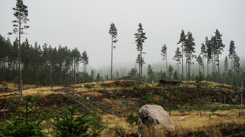 The original reference photo that Peter took while hiking through the Swedish woods. The little cabin, while certainly charming, does not quite compare to van der Rohe’s style.
You already mentioned how the landscape itself inspired the decision to transplant the Farnsworth House from its original location in Plano, Illinois to the Swedish woods. Can you elaborate a bit more on the creative process that lead to this piece?
I really enjoy creating complex environments in 3D. After evaluating the different layers of grass, stones, woodchips, sticks, moss, chopped trunks, bushes, small trees and the big giants, I like to see it grow step by step. Arrangement and composition are the real creative parts. Forest Pack allows you to paint the vegetation on the surfaces like in a real painting. The foggy and overcast sky was interesting to achieve as well. While not planned originally, one of the best parts about 3D is to play around with the light, so I ended up with different lighting.
Once you had a rough concept in mind, how did you then go about realizing it? Can you walk us through the development process step by step?
The main issue with a scene of this complexity, involving millions of polygons and alpha maps, is trying to work as ordered and clean as possible. First, I created test scenes for all of the plants. This way, I worked on the various shapes, textures, shaders and behaviors, before bringing them over into the main project, which is much faster than having to load millions of objects all the time.
After that, every plant was directly transformed to a Corona proxy and each group of plants got its own layer. This makes the scene easier to handle overall, and you can test every layer by itself. Forest Pack also helps a lot with performance and tells you exactly where a problem might occur.
In the end, the scene needed around 40GB of RAM for rendering. This is quite a lot, but if necessary, there is a lot of power that can be saved, for example by reducing the amount of the assets as well as the details in more distanced places in the scene. You could also split the picture, render it in, say, three layers and bring it back together in Photoshop. Fortunately, RebusFarm has no problems with big scenes like that whatsoever.
What were some of the challenges you had to overcome?
Next to the different forest layers I already mentioned, the hardest parts were the big conifers. I must’ve started all over three times until I was halfway happy with the shape of the trees. In the end, GrowFX and Megascans made it happen.
It took me about a week in total to complete the project. After the environment was done, I played around with different camera angles and ideas a lot. I also took a break for several days and changed a whole bunch of things after.
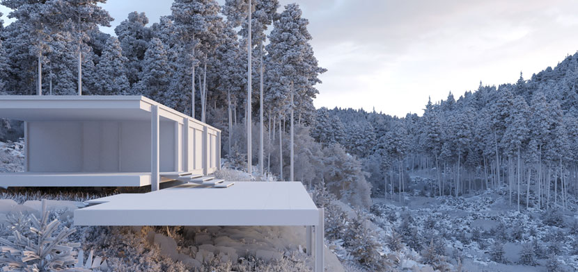 ‘Farnsworth House’, clay render. The minimalistic building seems almost like a simple task compared to the layers of vegetation.
Let’s switch gears one more time and at least briefly touch upon the state of VR technology. There seems to be an increasing demand for virtual reality in the archviz industry.
VR is a tricky thing. Two years ago, we also thought VR is the next big thing. This belief even influenced the naming of our studio, vriction. But we soon realized that the technology does not allow for the big boom everyone was hoping for to happen yet. Clients and gamers just don’t want to wear these clumsy and sweaty glasses for longer than ten minutes at a time, and the resolution also kills a good amount of realism.
That being said, as a concomitant gadget for projects, it’s great. Being able to sit or stand in your future project feels amazing! Your client can almost touch it. Just place VR glasses on their heads you are sure to increase the wow factor immediately. For presentations, you can use panoramic renders on tablets and smartphones to look around in real-time. Considering what’s coming next, VR will surely have a fixed place in archviz, product design, and fair projects.
Will VR become the standard eventually or is it not feasible in the foreseeable future?
I wouldn’t say VR will replace classic renderings anytime soon. However, seeing what will be possible in the near future, there are good reasons to be excited. Once the resolution catches up with our eyes and head tracking becomes possible without any external sensors, we will reach a completely new level of immersion. I even read about new render techniques to calculate pixels around objects, allowing you to render a single photorealistic image with depth information and head tracking. Now, that sounds like powerful stuff to me!
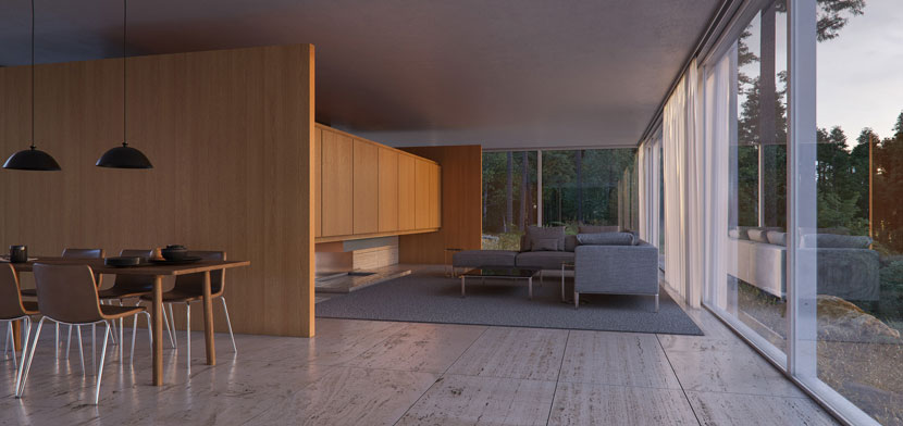 ‘Farnsworth House’ interior. According to Peter, we’ll have to wait a little while longer until we can fully experience scenes like this in VR.
Please describe your experience with RebusFarm thus far. Is there anything you particularly like about our service?
The three years that I’ve been using RebusFarm by now have only reinforced my initial decision for your service. Your support is great and it only took a few projects until I became pretty good at calculating quality and costs.
In closing, is there anything else you want to say? Any present or upcoming projects you’d like to mention?
First of all, thank you for choosing my work. As you feature a lot of great artists, I’m honored and happy my work receives the same recognition! Regarding future projects, I once again want to point you towards vriction. There is a lot of stuff happening right now and we can hardly wait to release some amazing projects soon, so please watch out for that. Cheers!
It was our pleasure! Thank you very much for taking the time and all the best in the future!
Keep up with Peter Oldorf and his work here:
How to join ArtWanted!
You want to get featured in our ArtWanted! campaign and win 50 RenderPoints on top? Submit your work, rendered at RebusFarm, to 该邮件地址已受到反垃圾邮件插件保护。要显示它需要在浏览器中启用 JavaScript。! Visit our Art Wanted! page for more information.
>> Read more articles on our blog
