Wednesday, September 8th, 2021 by Kay John Yim
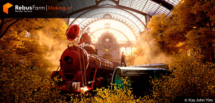
A useful and inspiring story for all of you who want to unleash your creativity! The creator of 'Apocalypse Never Comes Twice', CGI artist Kay John Yim, gives us details on his process for making this beautiful recreation of Antwerp Central in Belgium. A beautiful piece that shows how the pandemic was for him, as for many others, an opportunity to make some introspection and turn a negative situation into something beautiful, into a chance for spending time with yourself and develop new and amazing projects.
Let's have a look at John's creation process, challenges and lessons learned.
A brief intro to me and my work
My name is Kay John Yim, and I go by 'John'. I am a chartered architect and CGI artist based in London. I currently work at the forefront of concept design at SPINK Partners – a British architectural design practice based in London – delivering CG renderings for marketing, design development discussions and eventually construction.
First inspired by Final Fantasy XIII in 2019, my interest in CG grew over the decade. I started learning CAD software (AutoCAD, Rhino, Revit, etc.) in architecture schools, and gradually took up rendering (primarily Cinema 4D, Redshift & Octane) in the past 5 years.
During the early days of my career as an architectural assistant, I spent most of the time doing 2D architectural drawings in AutoCAD. Being an architectural assistant to me felt like being a draftsman which was never what I expected to do in the architectural industry, I never quite had the opportunity to unleash my creativity. So when I officially passed my exam to become a RIBA chartered architect in 2019, I made the decision to specialize in architectural visualization, with just the bare minimum knowledge of rendering that I learned and practiced in my free time.
Conceptualization of 'Apocalypse Never Comes Twice' - a recreation of Antwerp Central
When London went into lockdown, I treated the extra time as an opportunity to expand my portfolio, challenging myself to create CG art regularly and to post it across all social media platforms. My online Instagram & Artstation portfolio came as a result of a year of learning and creating.
'Apocalypse Never Comes Twice' was inspired by photographs of abandoned architecture, as well as emptied streets during the pandemic. I was naturally drawn to Antwerp Central Railway Station, for its unique fictional aesthetic that has yet to be categorized to any architectural style. It was colloquially known as the 'railway cathedral' and had been called the most beautiful railway station in the world.
As both, an architect and a CG artist, recreating Antwerp Central in a fictional setting was a labor of love. It took me a total of 19 days to complete it from scratch to final render, a process that could be categorized into research, modeling, texturing and lighting with composition.
Research & Modeling
I initially searched and downloaded as many architectural drawings and photos as I possibly could, placed them all within a PUREREF canvas and referenced them at all times while modeling.
I used primarily Rhino to plan and model the Antwerp Central main building facade.
Rhino has always been my primary software for architectural modeling, as it excelled in handling NURBs - a much more efficient and accurate way to model curves and surfaces in comparison to MESH.
I first outlined the building elevation in Rhino in reference to various flat-on (non-perspective) photos. This determined the proportion of the facade in relation to its openings; the building scale was dictated by balustrades, which were universally constructed around 1.1 meters tall.
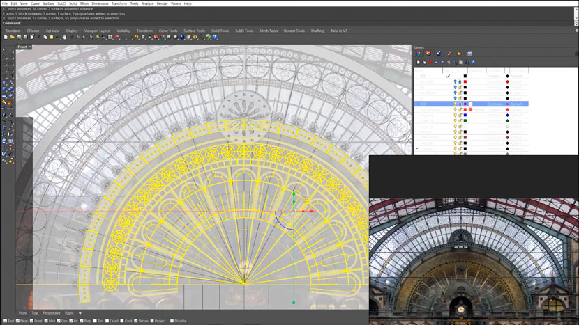 Antwerp Central Facade modeling in Rhino.
The Antwerp Central facade was highly decorated with architectural ornaments; it seemed like a daunting task to recreate at first sight, but upon closer examination, they were highly repetitive. I had a library of ornamental modular elements that had gradually grown over the past year, most of which I sculpted and retopo-ed in ZBrush. I imported a couple of ornamental modules into Rhino to be arrayed and instanced in a manner that resembled ornaments of the existing Antwerp Central building facade.
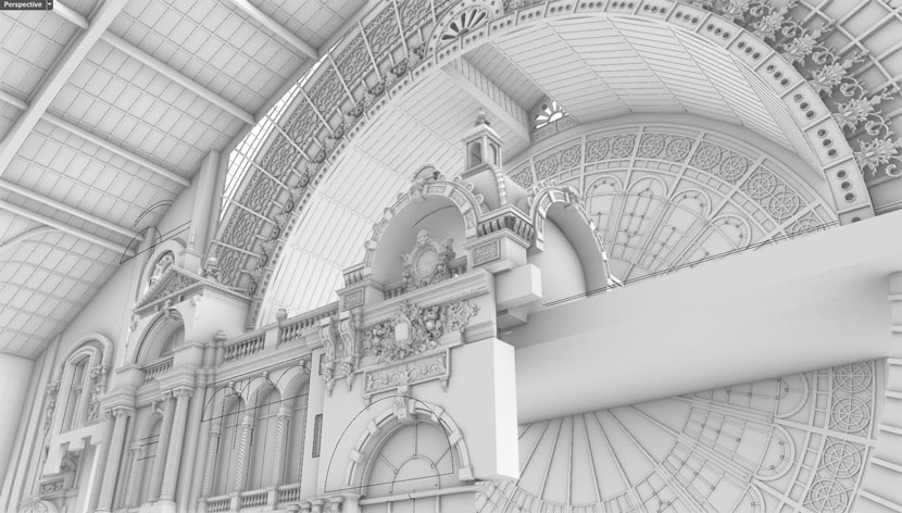 Sculpting of ornamental elements with ZBrush.
Having experimented with architectural modeling in Maya, Cinema4D and Houdini over the past couple of years, Rhino by far still had the most efficient tools in placing complicated mesh over curved surfaces accurately - one of which was 'flow along surface'. It placed one mesh over a surface based on a specified based surface.
The outer structure of the building took a lot of trial and error to model, as the references available online were significantly less than the main facade. I was essentially eyeballing and tinkering the outer structure model until it proportionally fitted well together with the main facade.
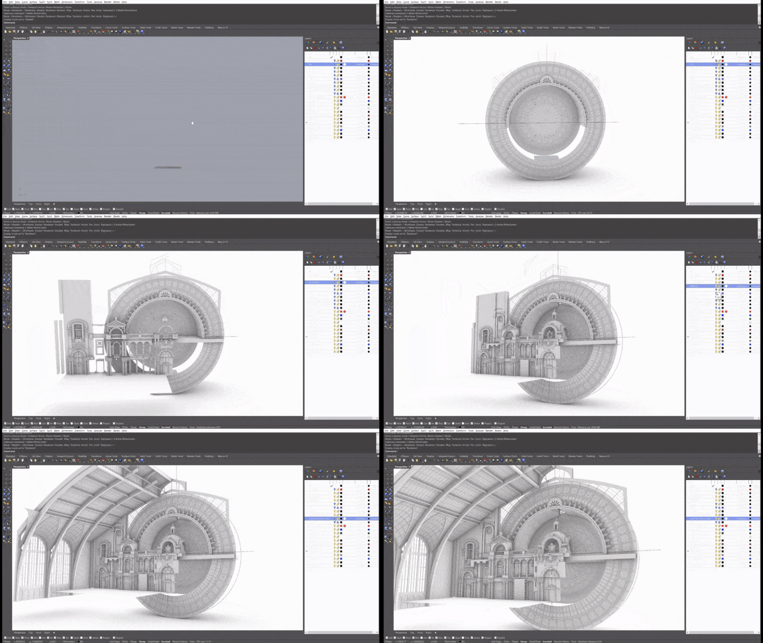 Modeling the outer structure of the building.
Upon finishing half of the building's facade, the model was then exported into MOI to be converted to FBX. MOI (Moment of Inspiration, essentially a lightweight NURBs modeler) did a much better job than Rhino at exporting quad meshes from NURBs, which facilitated texturing or further modeling down the line in Cinema 4D & Redshift - my preferred software combo for set dressing and rendering.
Half of the building's facade was then instanced and mirrored in Cinema 4D, for it was designed to be symmetrical.
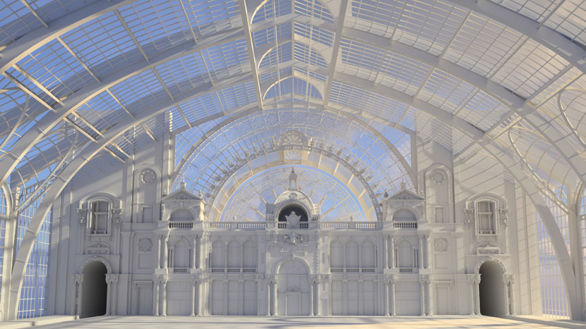 Symmetrical mirroring of the building on Cinema4D
Texturing
I usually use tileable brick texture maps for texturing architectural environments, but the Antwerp Central had a very specific brick pattern that was very challenging to replicate solely with tileable textures. I ended up placing all the bricks in geometry, partially placed by hand and partially instanced with Cinema 4D Cloner along specified splines.
I then applied a concrete material over all the bricks, with the texture UV and color randomized by geometry ID to create a very subtle differentiation among each brick that looks natural to the eye, either close up or from a distance.
The rest of the building facade was mostly textured with Megascans tileable textures, with Maxon noise added to the diffuse and roughness channel to mimic the subtlety of surface imperfection in real life.
The trees and foliage were essentially variations of Beech trees modeled in Speedtree, instanced on the ground with a Cinema 4D Matrix with randomized position, scale and rotation.
Lighting
My usual lighting setup (a Redshift Dome Light + a Sun & Sky Rig) did not work as well as I anticipated, due to the railway-facing Antwerp Central facade being partially indoors, in addition to an unusual amount of overgrown trees and foliage.
I experimented with placing 'fake' spotlights around the scene - a very time-consuming process that took a lot of trial and error. Ultimately there were a dozen fake spotlights scattered across the scene in between the camera and the facade, mostly illuminating the low-level foliage to add a sense of depth to the final render.
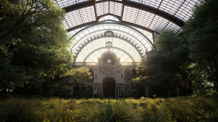 Final view of the lighting work for 'Apocalypse Never Comes Twice'.
Composition and story-telling
The final composition and narrative were spontaneous - both of which gradually developed in my mind when I realized the building facade alone was too flat to hold up the final image. The early renders lacked a subject of focus. This led to the decision of adding and modeling abandoned train locomotives and carriages, which were textured in Substance Painter with dated paint and rust.
Abandoned trains were added as a subject for the final render.
Together with a final touch of fog VDB, the addition of abandoned trains brought one of my favorite versions to life - realistic enough yet still had room for imagination.
I kept on iterating around the fictional concept of post-apocalypse and started adding characters to make the image more relatable. I used Character Creator and Marvelous Designer to create the characters, iterated through various poses to figure out the best dynamic among the characters, the abandoned trains and the Antwerp Central building facade to serve the final composition.
Character Creator and Marvelous Designer were used for final details and composition.
I also took a bit of artistic liberty when texturing the trees and ground foliage. For instance, the sub-surface scattering radius and amount were unrealistically high to create a painterly and dreamy atmosphere when light passed through.
I spent days experimenting with different color combinations of trees, foliage and HDRI environment, and eventually settled on a warm, dreamy and hopeful atmosphere that juxtaposed the time of despair that the apocalyptic story was set in.
Challenges and lessons learned
One of the biggest challenges was optimizing my time in modeling assets against the final composition. I have placed too much focus on modeling the building facade details from early on; in retrospect, a lot of the modeling time could have been better spent in shading or lighting since most of the building facade was eventually covered by trees and foliage.
Nevertheless, it was a great lesson learned, and more importantly, I had a great time modeling, rendering and weaving together a fictional fantasy that I wouldn't have enjoyed otherwise!
We thank John for sharing all of his knowledge and the lessons he learned from this beautiful project with our Rebus family. Check out more of his work on his channels:
Want to share your work with our community too?
Contact us at 该邮件地址已受到反垃圾邮件插件保护。要显示它需要在浏览器中启用 JavaScript。and tell us about your favorite project.
>> Read more articles on our blog
