Wednesday, May 11th, 2022 by Robin Walker
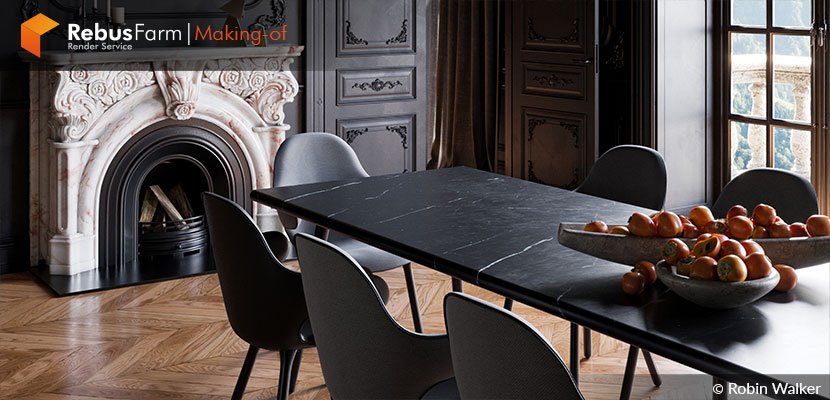
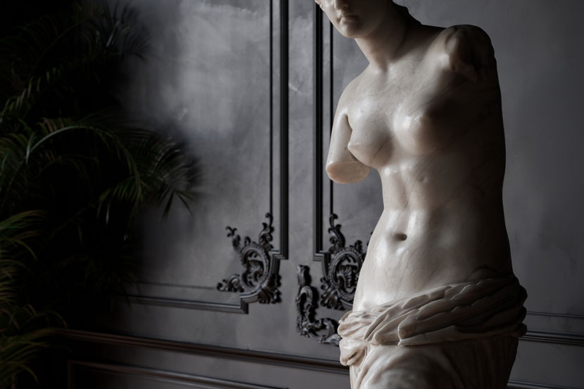
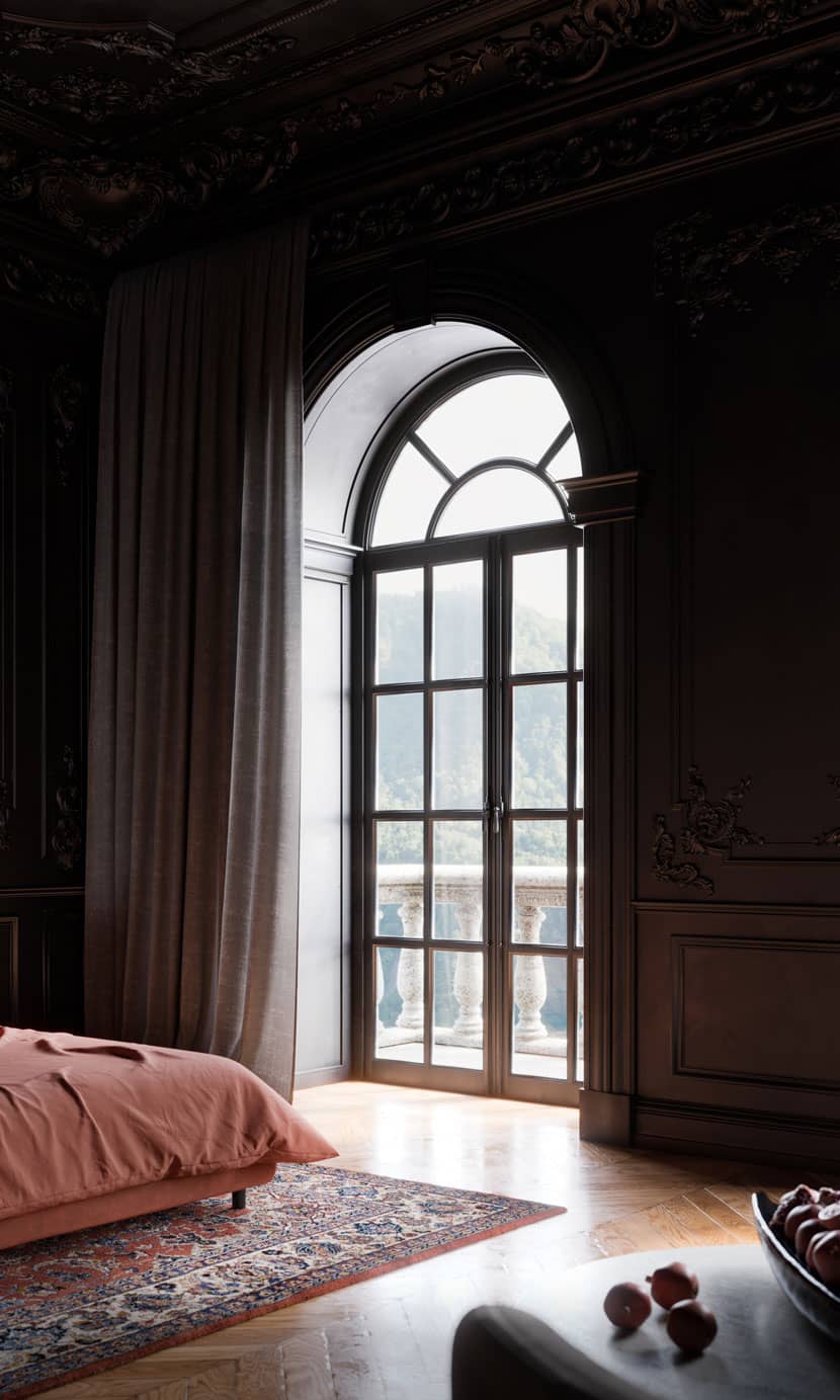
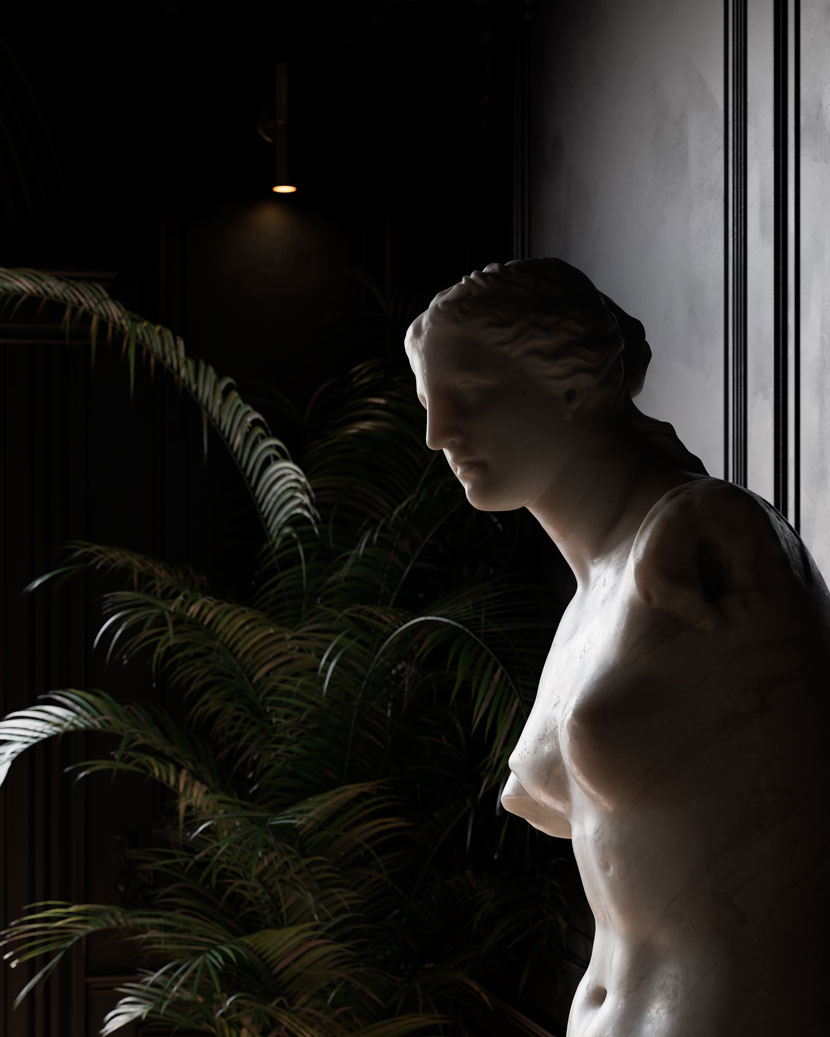
A huge fascination for statues and busts were the starting point for this awesome architectural visualization, which turned out to be so much more. The mysterious 'Black Neoclassical' was created by Robin Walker, who is a passionate 3D artist.
Let's welcome Robin and hear what he has to say about the creation of his 'Black Neoclassical'.
ABOUT ME
Before I start, I would like to thank Rebus Farm for inviting me to create this 'Making.of' article. My name is Robin Walker and like many others in the industry, I studied architecture up until the point that I realized AutoCAD is nowhere near as much fun as 3ds Max. I became fixated with 3D while studying architecture, I threw away my Warhammer and model making skills and became a full 3D nerd.
I've been working in the Archviz industry in London for about 6 years now, and I am currently running the show at Wearenarrativ alongside my very good friends Luis, Manel and Angela where we are planning world domination.
ABOUT BLACK NEOCLASSICAL
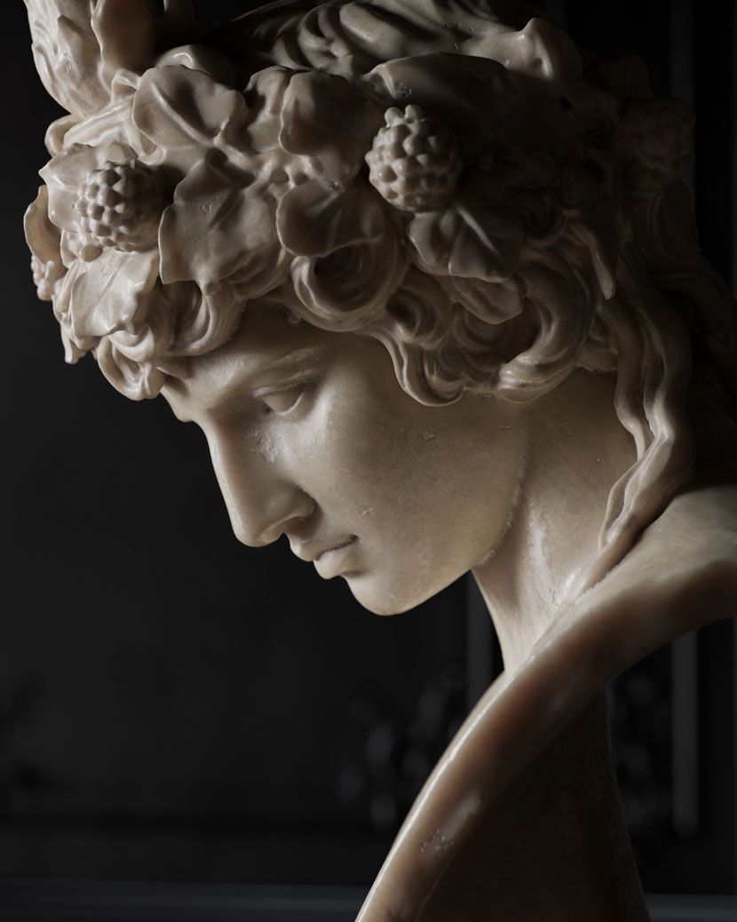
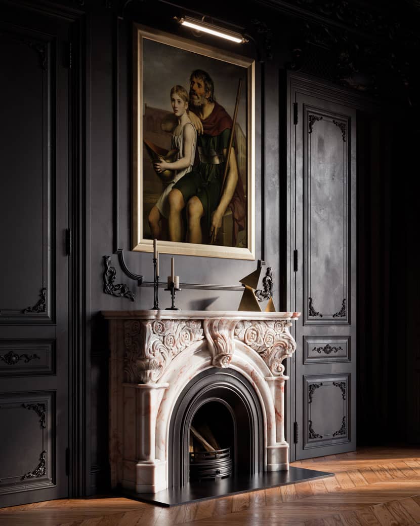
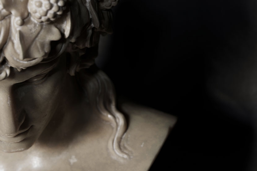
Black Neoclassical had been brewing in the back of my mind for a long time. Prior to making it, I had a bit of an obsession with marble busts and statues. I would endlessly sit there in 3ds Max orbiting around Hercules or some other god, creating moody and dramatic camera angles. Black Neoclassical is obviously about more than just the busts and statues, but that's where it all started for me. I used 3ds Max, Corona Renderer and Substance Painter to create this project.
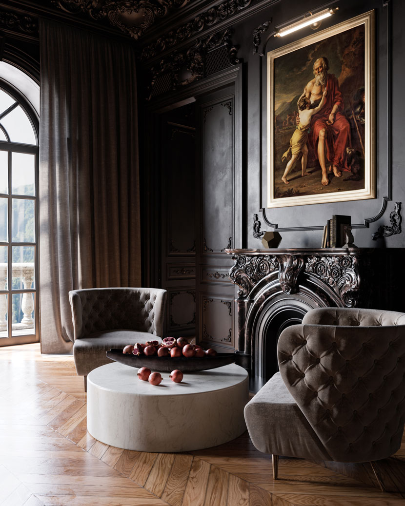
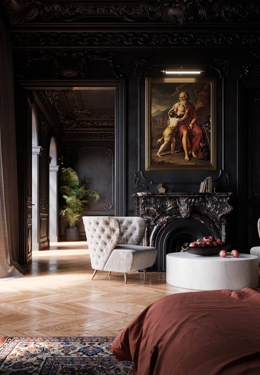
Visually, I wanted it to be classical and dark, maybe a little gothic. Emotionally, I wanted it to be mysterious and moody, but still believable. From an artistic and technical standpoint, it was a playground to push my skills and really experiment.
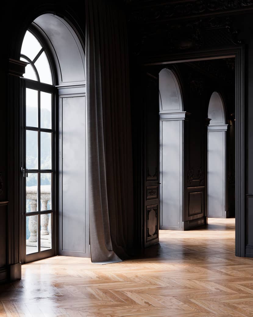
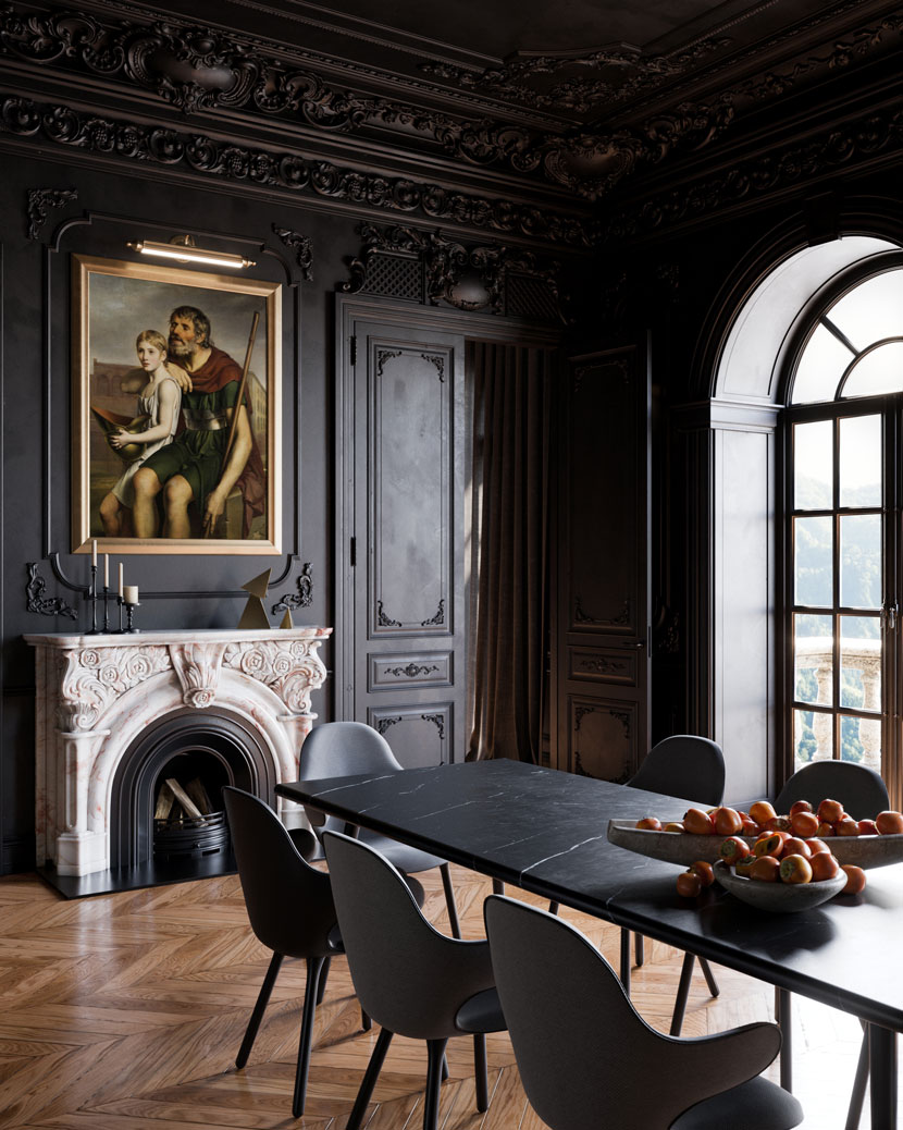 Black Neoclassical

MODELLING
I used a website called Dikart which supplies actual classical moldings for rooms but also gives you the 3d models, it's like the classical interior kitbash! I make it sound easy, but it was both fun and a challenge. I used hundreds of pieces and I also had to use the Geometry projection script at times to project decals onto shapes. The overall interior was not copied from anything existing, but really just the fusion in my mind of inspiration I had looked at prior. I didn't want it to be light and airy; it needed to be dark and juicy with quite a solid feel, so I really layered up the details in areas.
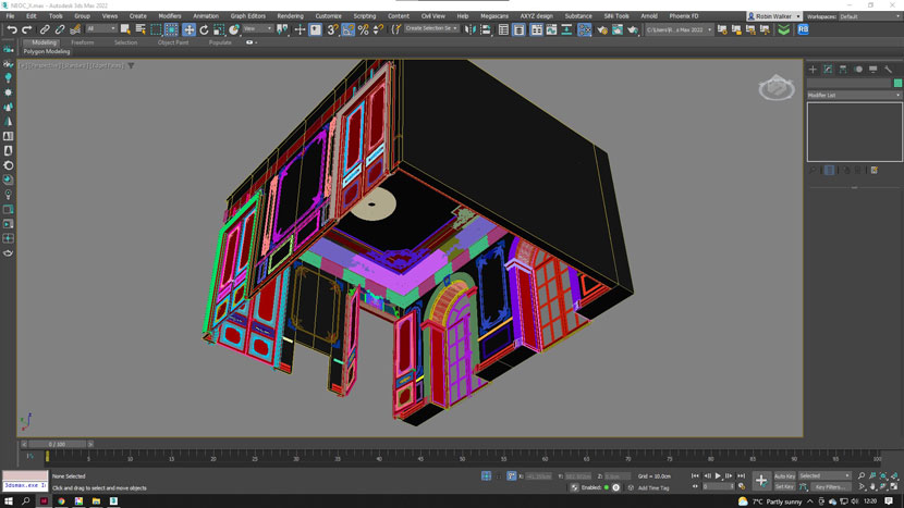 Creating the room in 3ds Max
USING SINI TO KEEP THE SCENE LIGHT AND EASY TO WORK WITH
I can't live without Sini and I use it to attach stuff all the time into one mesh. Sini has tons of other useful features to speed up work flow and make life easier.
Using Sini in 3ds Max
COMPOSITION AND LIGHTING
I looked at and absorbed a lot of inspiration, but also just let myself go and tried to trust my instinct while hoping to add something personal. I think it's really nice sometimes to forget about camera settings or rules and just fly around the model until you see something you like. I did a lot of bad shots when I was experimenting, but it's all part of the process, the more you fail, the more you learn. This might sound crazy, but a turning point for me in my career recently was playing video games that have a photomode. I would spend countless hours experimenting, taking photos in Cyberpunk 2077, Death Stranding, Forza Horizon and Assassin's Creed. They may not be super photoreal or strictly architectural, but you get to experiment and practice at such a fast rate. You see what works and what doesn't at a fundamental level — color, focus, depth of field, composition and lighting — then you take it back into your work.
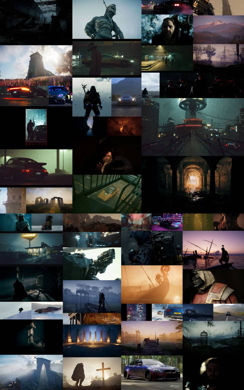 Experimenting with Photomode in video games
MATERIALS
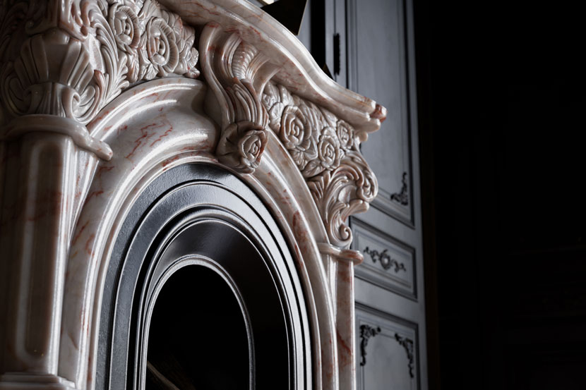
I will highlight and go over a few materials throughout this making of, but a key factor in this scene was adding that extra level of detail. Most of the main materials were made from scratch such as the floor, marbles and walls, but if they weren't then more detail was added such as the persimmons with extra layers of dents and scratches. Anomalies and imperfections all help in creating the grand delusion of CGI, so checking references of real life is the key here.
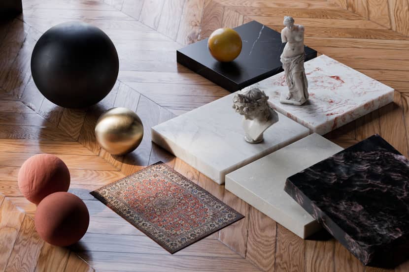 The main materials
Colors
Having a consistent color pallet is pretty important when creating images. Also, the more colors you introduce, the more visually complex and chaotic things can become. For this project, I preferred a solid and minimal pallet.
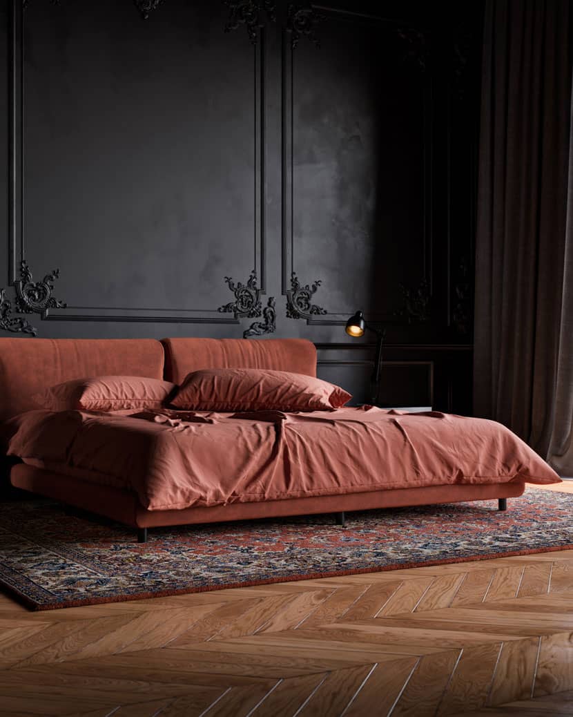
OVERALL SETUP - KEEP THINGS SIMPLE
I like to keep things simple, so the scene setup is relatively vanilla, generally you don't need to change anything in Corona's settings, just leave them at stock. One of the most important things I have learned throughout my career is to keep things technically simple and focus on art direction first. Using a super rare custom LUT or having the latest Gigaripper 5000 CPU isn't the key to good images, contrary to popular belief. I did however make some tweaks here and there which helped this particular project.
CORONA SUN AND SKY FOR THE ENVIRONMENTAL LIGHTING
Good old Corona sun and sky. I wanted the feeling of semi overcast but also the realism that in some shots the sun would poke through a little more as the clouds moved, so I varied the sun intensity from about 0.05 to 0.4. I raised the size of the sun as well, so it was softer. Corona sun and sky did 95% of the lighting; the internal small lights here and there don’t do much and are more for aesthetic purposes.
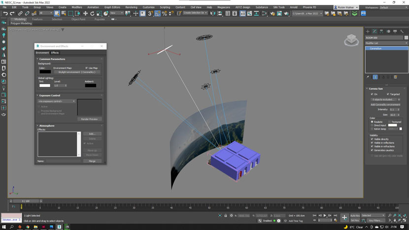 Global lighting setup in 3ds Max
THE FLOOR AS A CORONA RAY SWITCH MATERIAL
This is the first time I've ever had to use this actually, but without it the floor reflected way too much color onto the walls. I made a desaturated version of the floor material and plugged it into the Global Illumination, Reflection and Refraction slots of a 'Corona ray switch material'. The original floor material was plugged into the Direct override slot of the same ray switch material.
TURNING REFLECTIONS OFF IN THE BACKPLATE MATERIAL
This was another thing I don't usually do, but dark scenes can be a bit trickier. I had some odd results with the walls looking patchy, so I unticked 'Visible in reflections' on my backplate material and things looked a lot better. Do what looks best is the moral of the story: break the rules, test and adapt.
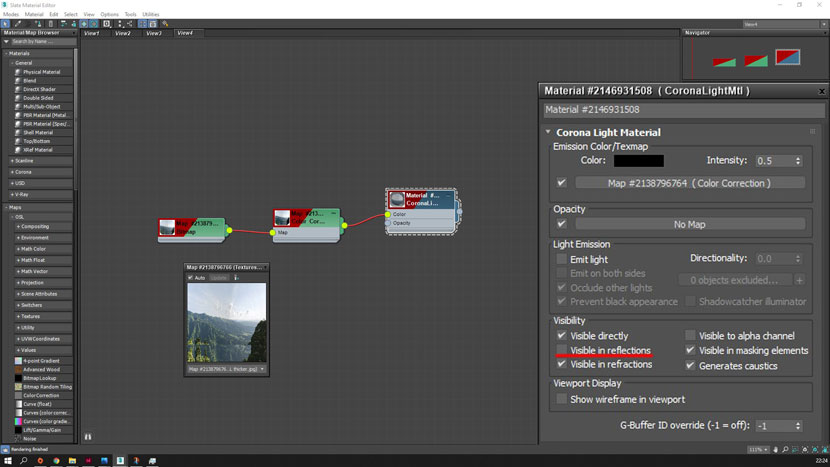 Backplate material in the material editor
FRAME BUFFER
Not much to see here really, I used an LUT but I could have achieved something similar by playing around with the curves or other settings; it worked for this project though, so I went with it. I gave the images some final tweaks in Photoshop, slight contrast adjustments, minor color balancing, popping out a few areas etc. nothing that major though.
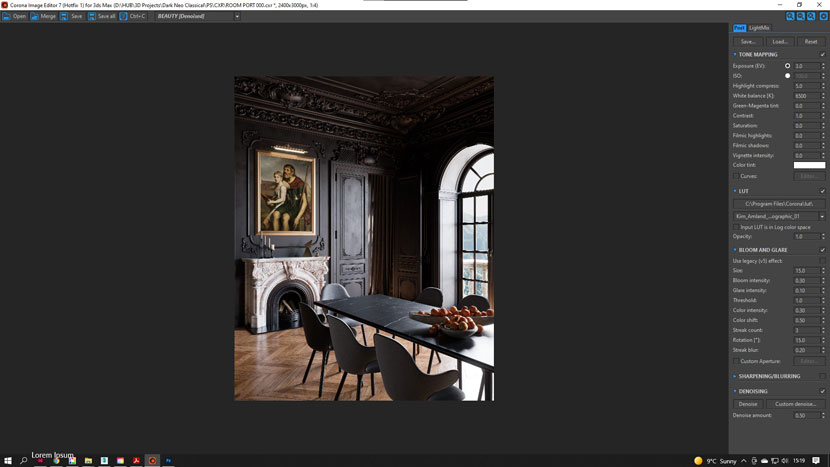 Corona image editor for 3ds Max
FLAGS
So I just found out what these are in photography (while writing this) and it turns out I made my own ‘flags’ for some of my bust shots. Flags are basically something used to block light and cast shadow, in real life a photographer would probably use a piece of black foam or card. Not all the bust shots needed them, but for some it really helped to create much more dramatic lighting.
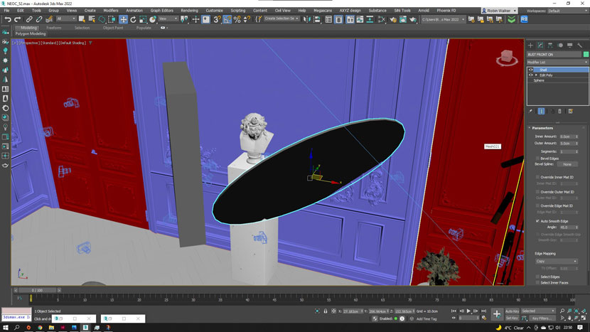 Using flags to create dynamic lighting
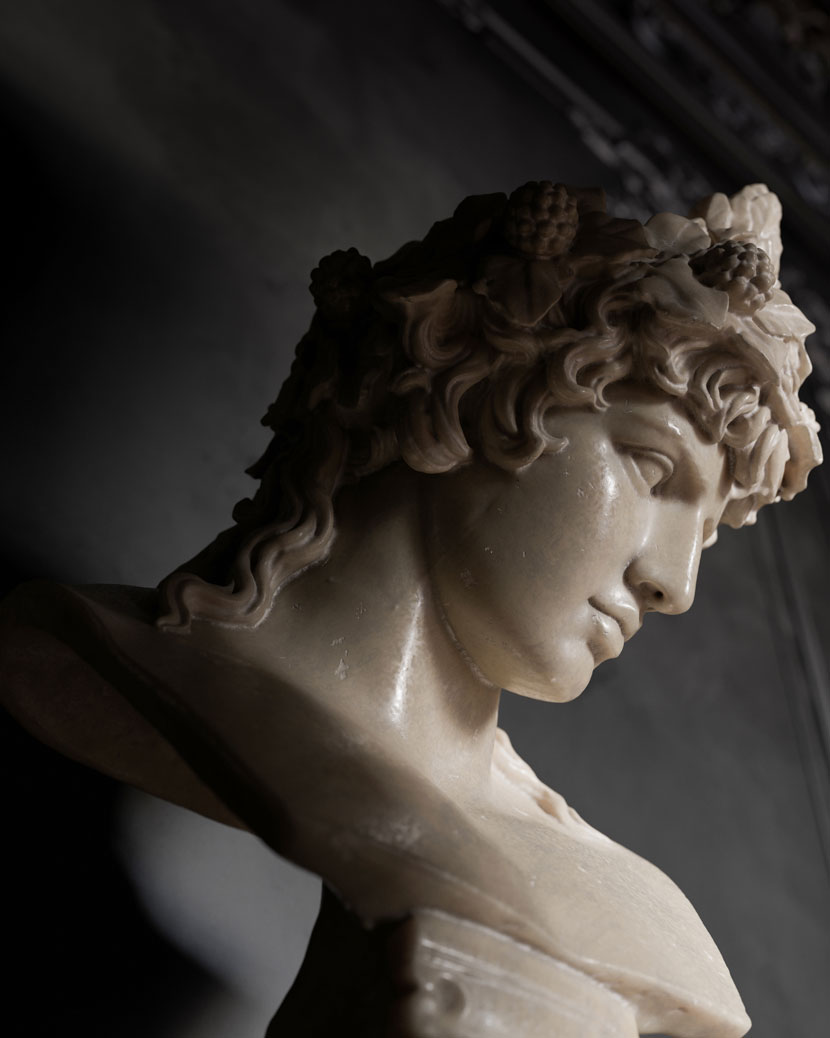 Dynamic lighting on the bust
MARBLE MATERIAL
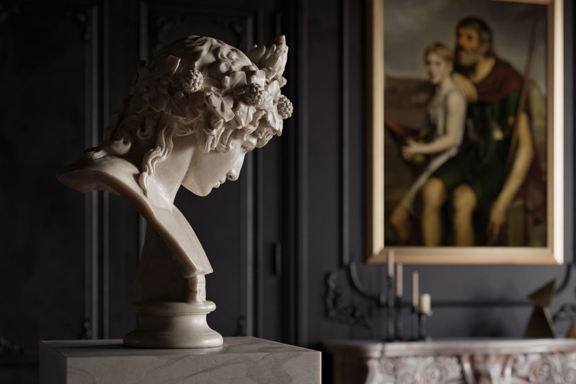
When I looked at references for marble statues and busts, I noticed there was really quite a lot going on. There is dirt in the grooves, erosion on parts, cracks and chips all over sometimes. Additionally, I noticed the hair can be a rougher marble. It's good to spend a while obsessing over the references before you start creating the material. Make a Pinterest board, go to a museum, spend your life savings on a real marble statue.
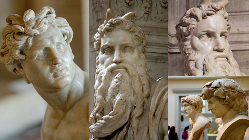 Examples of real marble statues and busts
The whole material is essentially formed of a base SSS material with layers of dark and light dirt/erosion on top using Corona Layered Material. Small details such as the chips being a rougher and lighter marble really help to bring it to life. Then there is the hair, which is overall a rougher marble than the rest. I used Substance Painter to auto unwrap the geometry and create a mask for the hair.
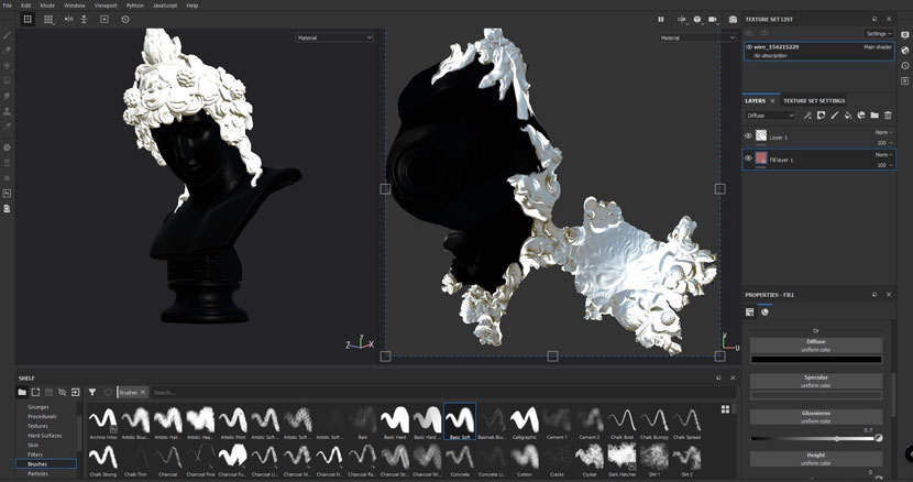 Using Substance Painter to auto unwrap and create a mask for the hair
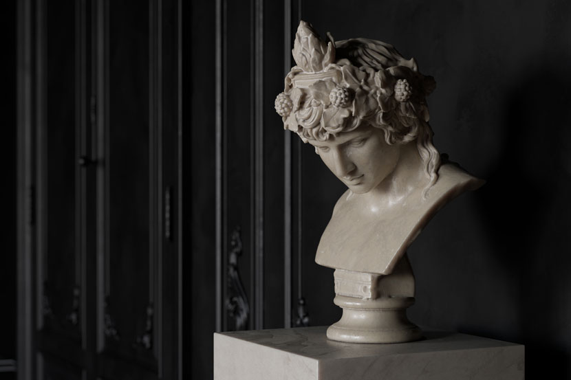
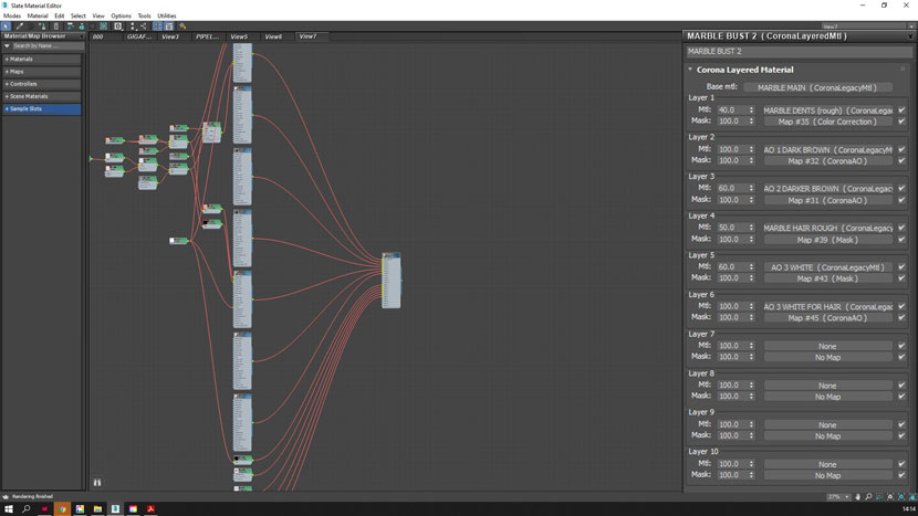 Layering the elements
I try to avoid making overly and unnecessarily complex materials, but sometimes it has to be done. A step by step description would take a while (and probably better as a separate video) but the fundamental part is the layering of the elements to add more realism.
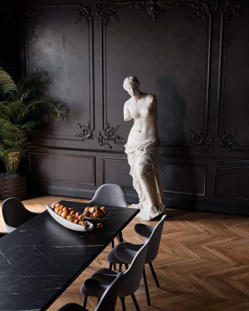
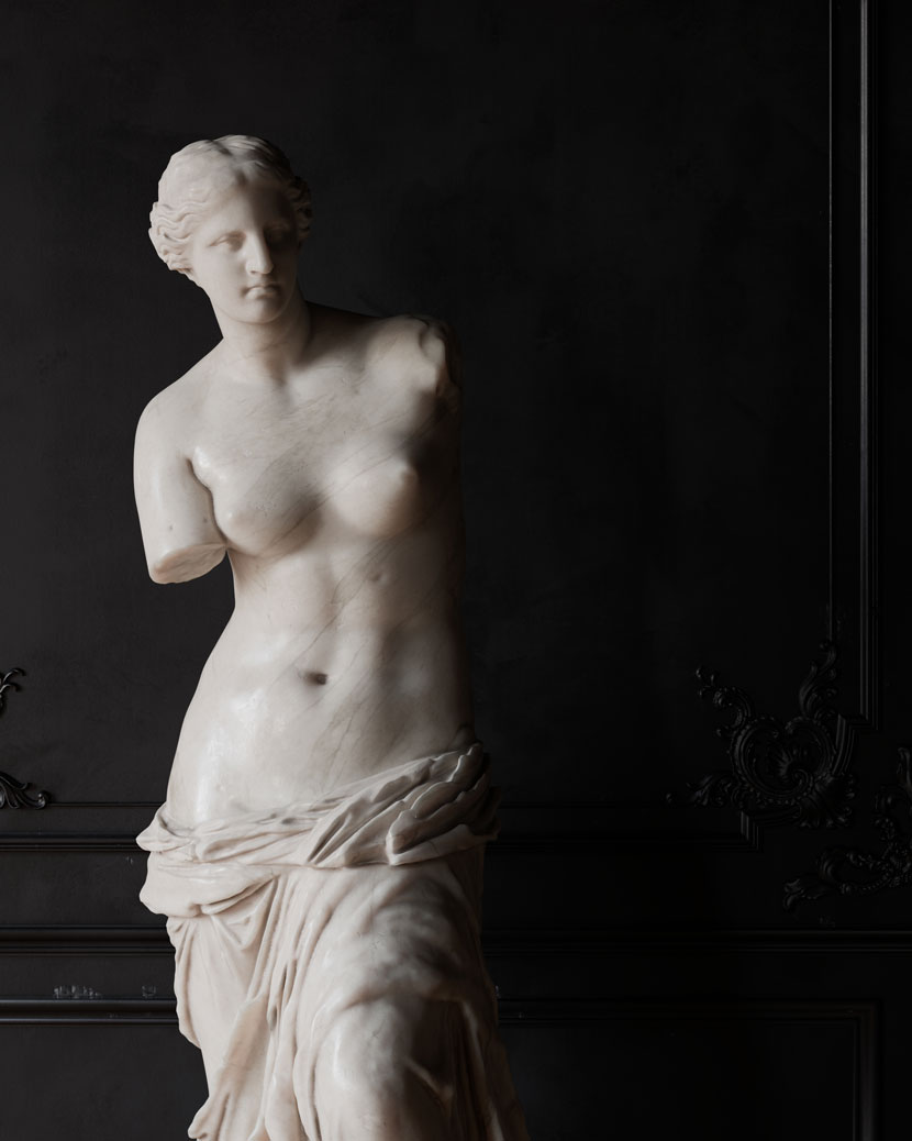
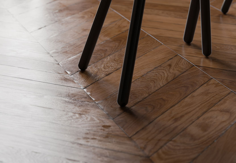
The floor material follows the same principles as the marble in that it is all about layering up anomalies, dirt, scratches etc. to build up the realism. To create the physical boards, I used Floor Generator.
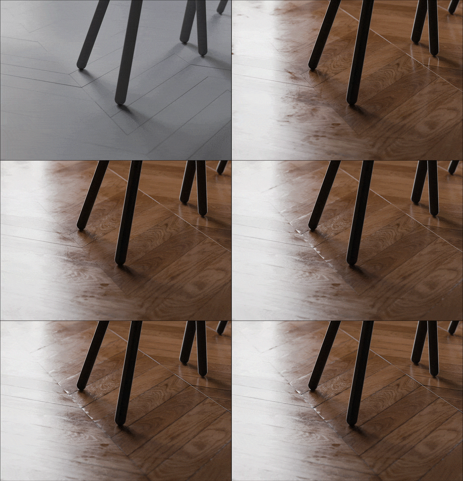 Build up of layers of the floor
IMAGE SELECTION
Last but not least, after I had finished the project I had to single out my favorite shots, which means being brutally honest with yourself and sometimes dropping the ones you worked hard at. I think it's good to show them to friends (particularly outside archviz) and colleagues as well, as it's nice to get a fresh pair of eyes. I used PureRef software, which is great for quickly laying out images and is very easy to use.
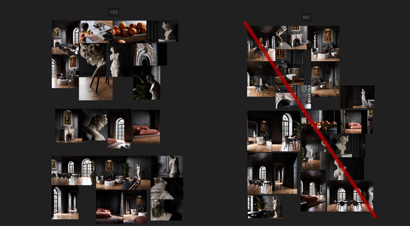 Using Pureref to narrow it down
Thanks again, Rebus Farm for this great opportunity.
We are very happy about this making-of and thank you, Robin, for your time to share all this great knowledge with us. Make sure to check more of Robin's work or connect with him on these channels:
Want to share your work with our community too?
Contact us at 该邮件地址已受到反垃圾邮件插件保护。要显示它需要在浏览器中启用 JavaScript。and tell us about your favorite project.
>> Read more articles on our blog
