Wednesday, January 5th, 2022 by Anthony Flores
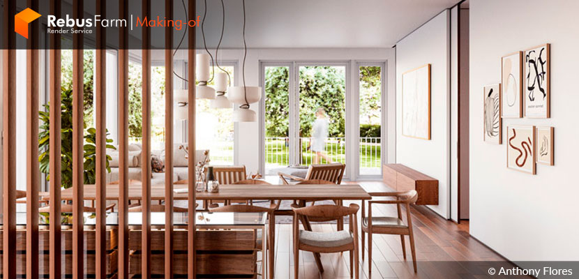
Connecting nature to interior spaces requires a fine selection of textures, fabrics and elements. Anthony Flores, architect and interior visualizer, merges vintage elements with current trends to achieve a minimalist environment that blends perfectly with its surroundings.
Today he shares with us important tips on how he developed this project with amazing attention to detail.
Let's hear him out!
Hello, my name is Anthony Flores, from Panama. After many years as an architect, I decided to start working as a 3D artist to explore and expand my passion for interior design, which led me to specialize in interior rendering.
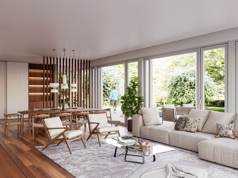 Country House, living area.
The project: Country House
Country House is a collaborative architecture project with G-T Architects. I had collaborated with this studio on several projects and in this one, I had the opportunity to conceptualize an option for the interior space.
References
The mission for this project was to transmit a cozy space that connected the exterior nature that the location offers, with homelike elements such as the furniture, fabrics and lighting.
I've always had an interest in the way brands such as Gubi, &Tradition and The Poster Club create spaces that combine vintage elements with current trends, to showcase their products onto them. This fusion of the past with the present is always a starting point for me.
Modeling
My main modeling software for this project was 3ds Max with Corona Renderer.
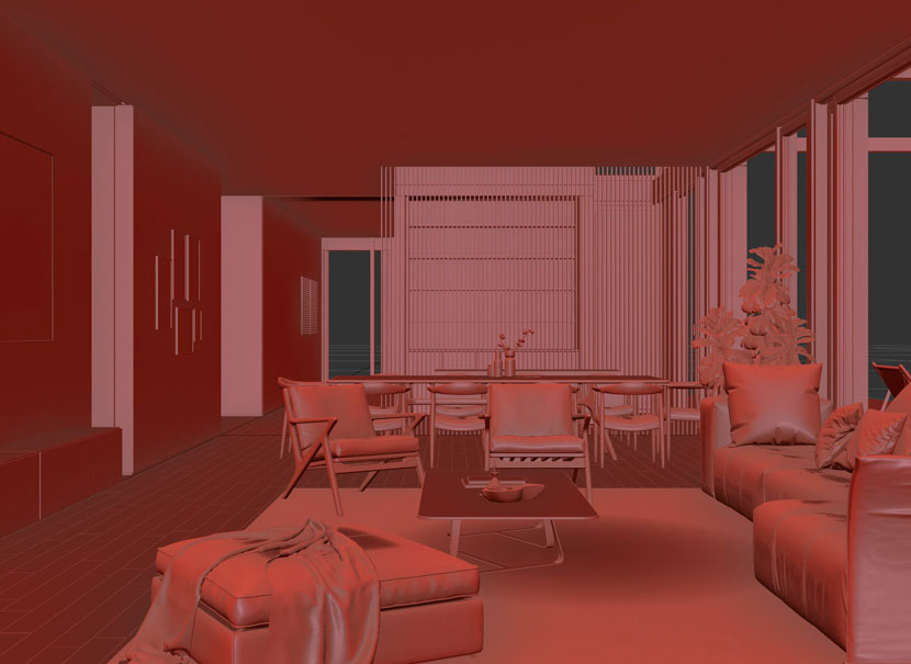 Modeling of the living area.
In this phase, I put special attention on having a structure that is well organized both in layers and elements. For me, it's very important also that the 3D model is optimized in order to simplify the process for any changes required by myself or by the client. This also gives me the liberty to explore different options from the same model.
The furniture was carefully selected to highlight the use of wood and fabrics in earth tones, featuring items of the brands Saba, More and Rimadesio. I always attempt to keep decorative elements and accessories to a few and make sure that they are always aligned to the style of the project; less is more.
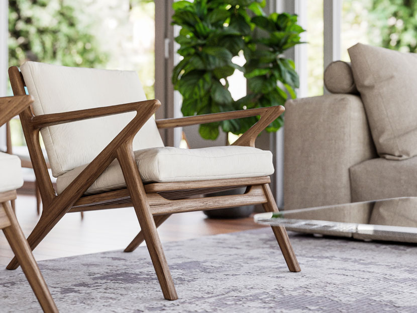 Furniture based on fabrics with earth tones and wood.
Lighting
Efficiency is key for me. I like to focus on simplifying the model to concentrate more on the composition of the space, so I usually use the default Corona Sky as the main source of lighting for my interiors. This setting avoids overexposed areas and guarantees a nice balance to the view.
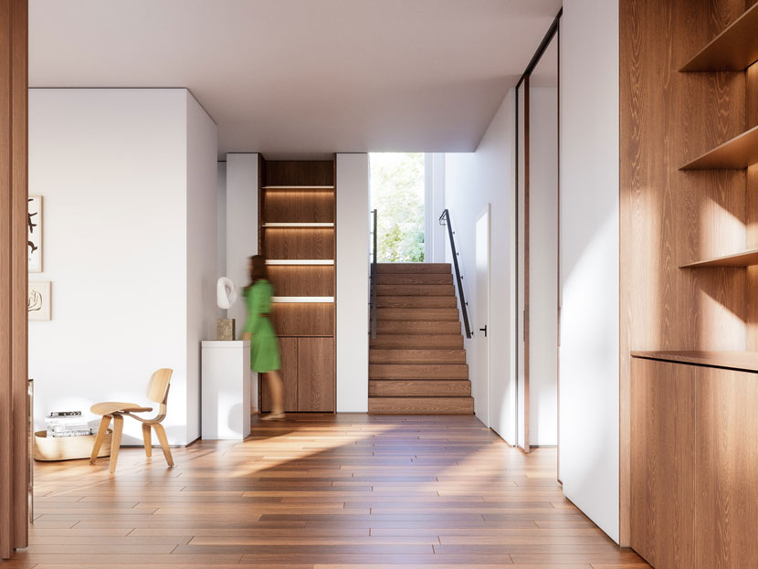 Lighting with Corona Sky.
Texturing
This is the phase in which I spend more time, and my main focus is to provide a feeling of realism on each item. For this project I used a 4K texture for the wooden elements of the floor, making sure that the repetitions of the pattern were not noticeable, which was achieved with the UVW Randomizer in Corona Renderer.
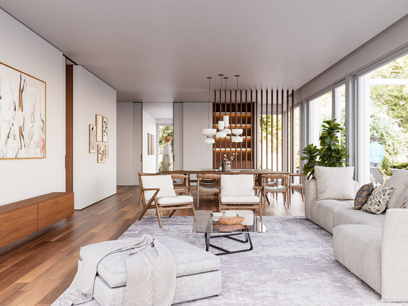
As you can notice, my workflow is very simple and for me, this is the main attribute of my work. As a designer architect, it is very important for me that the viewer understands the use of the space through the proposal, and the emotions and sensations transmitted through the render are the means I use to achieve this.
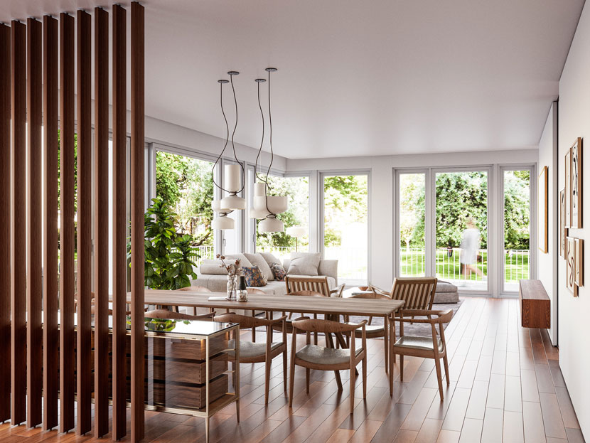 Example of functional division of spaces.
We thank Anthony for sharing your tips and amazing project story with our Rebus community. Check out more of Anthony's work on his different channels:
Want to share your work with our community too?
Contact us at 该邮件地址已受到反垃圾邮件插件保护。要显示它需要在浏览器中启用 JavaScript。and tell us about your favorite project.
>> Read more articles on our blog
