Wednesday, September 7th, 2016 by N. Herget

Over the last few weeks you might have noticed, we have the new “Art Wanted” campaign up and running!
Joining forces with our community, we want to show & share what we can achieve together, with each other at their best!
This time, we'll take Art Wanted a step further, as we'd like to introduce to you talented RebusFarm user Bryan Talkish from Already been chewed studio a little bit closer.
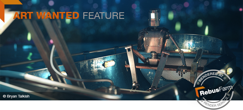
Check out his Art Wanted submission "Bog Scallops" — a personal project rich in detail and with a funny story behind, rendered at RebusFarm:
You can also find Bryan on behance, vimeo an instagram.
Despite his tight schedule, thankfully he found the time to answer some questions about his personal background and the story of "Bog Scallops".
Bryan, thank you so much for giving us an insight on your work and who you are. So, let’s go way back. Where were your born and raised? What was young Bryan like and how come he became a digital artist in the end?
I was born and raised in a small town in Northwest Pennsylvania. Young Bryan was an outdoorsy kid — catching fireflies in the summer, and sledding in the winter.
I remember drawing a lot, keeping sketch books filled with drawings ranging from landscapes, to characters inspired by the old-school marvel universe, to sci-fi scenes inspired by NES box art.
It wasn't until later when I got my first computer that I found my fascination with the digital world.
I recall buying a bare-bones editing software that was more for audio than video, but it came with an importer that allowed 320x240 clips on the timeline.
I kind of hacked it to export very low res mpegs and avi files. From here I collected clips from my favorite movie scenes and edited them into trailers, or cut a sequence of drawings together to form animations. I think this was the very early steps into where I am now.
Fast forwarding several years, after graduating with a BFA in Cinema and Digital Arts, I started working as an editor at a production studio located in Pittsburgh, PA. The job was part-time editorial at first, but it soon became a full-time position with motion design work added into the mix.
When After Effects came into the picture I shifted gears to design and animation. The software gave me more creative freedom and opened up a lot of doors into the motion, design, and VFX world that I wasn’t getting from an editing standpoint. It created this realization of where I eventually wanted to end up — working with 3D.
I remember becoming overwhelmingly inspired by artists posting their work to sites like vimeo and behance, and reading behind-the-scenes articles on community blogs and in magazines.
The research inevitably brought me to my true software of choice, Maxon’s Cinema4D. It was at this point that I saw how 2D, 3D, and post compositing worked so closely with each other in the production workflow.
Over the years of venturing through the world of motion and design as a full-time and freelance artist brought me to Dallas, TX where I work at Already Been Chewed as Lead Motion Designer.
Here we create visuals for clients such as Nike, Nixon, and Vans, to list a few.
One of my favorite campaigns I’ve worked on in recent history was the Nixon and Star Wars collaboration. Nixon had sought out Already Been Chewed to create a full animation campaign showcasing their new line of watches revolving around the Star Wars universe (C3PO, R2D2, Vader) .
We worked closely with Nixon and Lucasfilm through the whole creative process, developing several animated teasers and trailers to promote the light and dark side sets.
In my spare time I continue to work on self-initiated projects when an idea sparks, ranging from :10s micro shorts to longer animations between :30s and :60s.
Doing this allows me to get things out of my head, flex some ideas, play out scenarios, and creates this nice contrast between client work.
How would you describe your art style?
I like to keep my art style flexible, on it's toes, and ready to tackle the challenge of whichever style a project calls for, whether that be a 3D cel animation feel, in the realm of detailed-realistic, or even stop-motion. I don't see myself as someone with one distinct art style, but more like someone who can assess the techniques involved to get a certain look, then put it into action. I can say I do enjoy 3D surrealism and the stark graphic novel look.
What movie/and or game from the past do you wish you had worked on and why?
There's a beautiful game that was recently released called 'Inside' by PlayDead games. The artistry involved is absolutely stunning. The style has this dark storybook feel that creates an unsettling, yet luring sense of mystery during urgent and dire situations, and at the same time a certain stillness or calm. I found that the frame compositions, colors, use of light, and rich atmospheres led my eye to exactly where the creators intended me to look at any given moment. It's really cinematic. The way events unfolded, and the way the camera followed characters through this world allowed players to stop, look, and appreciate the art behind it.
Is there something you are currently working on or are excited about starting, that you can tell us about?
There are two projects I'm working on right now that I’m pretty excited about. I can't go into too much detail, but one revolves around virtual reality and the other is a super short involving volumetric fog, clouds, and wind streams careening off, flying by, and enveloping a high speed car in a stark, retro inspired style.
An early concept frame from 'Abyss Vaulter'
You used our render farm service for rendering this project. Have you used RebusFarm before and what are/were your experiences. What would you say are the advantages about using a render farm?
In the past I relied solely on network rendering and single machine rendering. As the projects grew in scale I saw how taxing it was not only in time needed, but on the machines themselves. Rendering put them in high-temperature situations over multiple days and nights, creating a massive strain on each one. Rebus freed them of that intense sprint to the finish line and shaved days off the turnaround.
One of my favorite aspects of using Rebus is the plugin. Sending scenes to the farm and then getting them back is a breeze. It’s incredibly helpful to see which files are uploading and which files are downloading as they render in the corner pop-up screen. A nice real-time feature. It reminds me a bit of dropbox.
After crunching some numbers on 'Bog Scallops' and coming up with some lengthy render times, it was pretty clear to go with Rebus for the rendering. I didn't want to put my machine through the gauntlet over that much time, so I uploaded all the scene files and had the entire project rendered in a matter of hours.
At Already Been Chewed, we looked towards Rebus' services to render some of the Nixon x Star Wars collaboration spots. Going this route lifted the render-time versus deadline scenario. We researched a couple other render farms beforehand, but once we tested Rebus, it was a unanimous decision.
Thank you, Bryan!
Now, back to "Bog Scallops" and its making-of. As we already mentioned, there is a nice story behind.
Let's follow this trip from the depths of the sea of inspiration up to the final result.
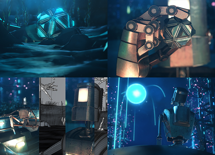
The origin story of Bog Scallops is on the ridiculous side. It began after a conversation about a menu item (sea scallops) unexpectedly escalated into the questioning of what other types could exist if not from the sea. This, in turn, somehow evolved into a story about a rare species of mollusk found only in the remote reaches of swamp-like climates that were said to contain a powerful alternate energy source. An energy source so potent that just one could power an entire city for years.
The conversation ended there, but I couldn't shake wanting to see this story happen in some form.
Before jumping into the software I created a sequenced shot list describing the action in each frame and the type of camera angle/move. After I locked down the shots, I started designing key elements, such as the main characters and important objects from sketches I had mocked up.
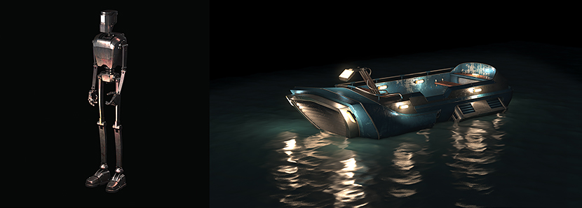
I remember starting with the boat because it was the easiest to visualize trolling through the lit-up bog and would create a nice center point for the following elements. I then moved onto creating the environment — first underwater, then above, placing the boat I had created into the scene to get the right scale.
After this came Bob, the robot caretaker, and so on. When all the main elements were designed and ready for final placement, I created a series of style boards for all the key moments. With these finished and in the can, I finally moved onto animation.
The animation process was divided into 2 types of files: The master scene/shot file that acted as my final render, and sub-scenes, which contained only the objects that needed to be animated and any objects that interacted with them while keeping everything else out. This allowed me to preview the animations much faster in my viewport, make detailed changes, and then transfer them into my master scene —swapping out the static objects with the animated ones.
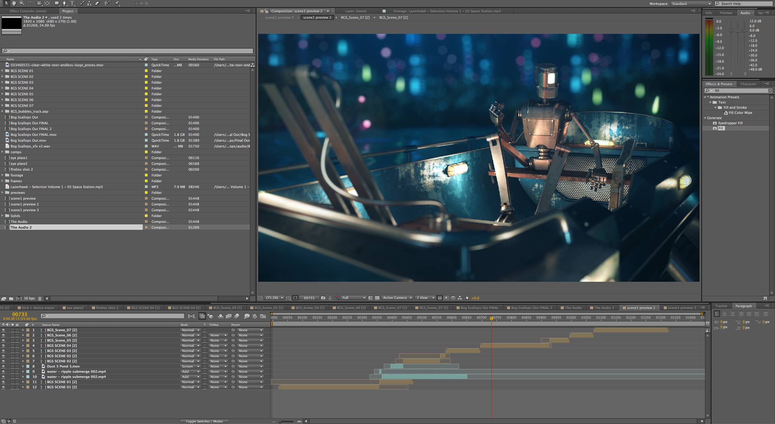
After Effects compositing
Preview Scenes
When all the scenes were animated and previewed as a full lo-res edit in my timeline, I sent them off to Rebus. After getting them back I swapped the lo-res preview renders out with the hi-res, applied all the compositing, and kicked out a final.
The final was then sent out for sound design — done by my friend and partner in crime, JM Cifonie, who has been doing all the audio for my animations for the past 4 years. Along the way I sent him style boards and preview animations so he could get a feel for the scenes. This helped him create, prepare, and collect sounds while the project progressed.
You'd like to join our Art Wanted campaign? Send in your work, rendered at RebusFarm to 该邮件地址已受到反垃圾邮件插件保护。要显示它需要在浏览器中启用 JavaScript。! Check Art Wanted for details.
