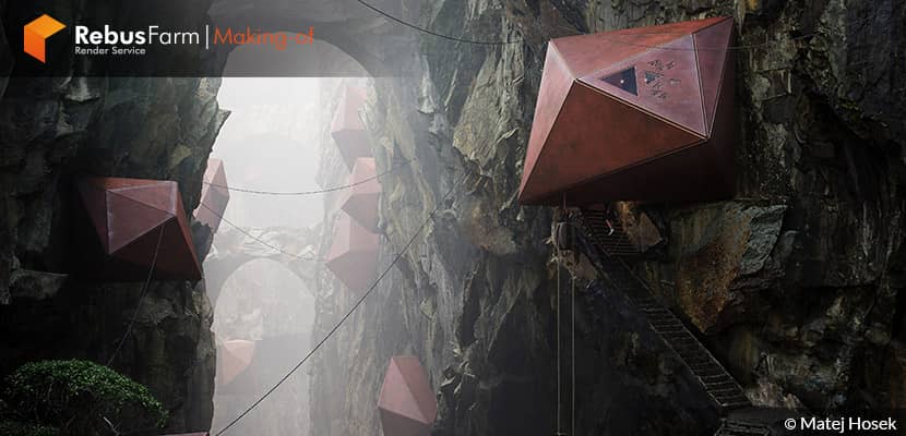
Let's explore an outstanding image in several moods and lighting scenarios. In this making-Of article, Matej Hosek from AsymmetricA, an architect who followed the architectural visualization field, drives us through his creative process when he works on personal projects. A general approach to image-making rather than “how to model this shape or which render settings to use”. Enjoy it!
About me.
Hello everyone,
I'm Matej Hosek and I have a degree in architecture but I’ve decided to pursue a career in ArchViz, as CGI was my passion since childhood, and was always impressed with the video game and movie industry. I currently work as a senior visualizer at AsymmetricA and teach a rendering course at the Architectural Association School Of Architecture.
About The Project.
The main goal of most of my work is to create a visually striking and accurate depiction of an idea while spending as little effort on modeling and asset preparation. It is because I prefer to keep things simple and I do not look at this kind of work as a modeling exercise. There are many more skilled people that can do this better than I ever will, so I want to focus on what I do best and that is to present a vision.
With extensive libraries such as Megascans, Maxtree, AI etc. it is really easy now to put our ideas on “paper” quickly. Almost all assets in my scene are ready-made with the exception of the design of course. I’d rather spend the extra time on improving the design, than going out there and start 3d scanning rocks and plants (again, I will leave that to the professionals!).
So as a disclaimer - I will be talking more about the general approach to image-making rather than “how I modeled this shape or which render settings I used”.
Software & Assets Used.
The software I used, as usual 3DS Max, Corona Render & Photoshop. For the Assets of this scene, I used Megascans, 3DPeople, Maxtree, CommonPoint, VDB cloud.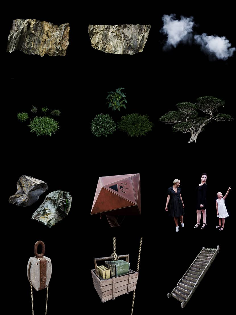
Reference.
I’m a big fan of Studio Ghibli and I hold all of their movies very dear to my heart. I already used some of them as inspiration for my previous projects and this time I found a very loose inspiration in Castle in the Sky. It is the archetype of the mining town and the use of clouds that I found the most impressive sets of this movie.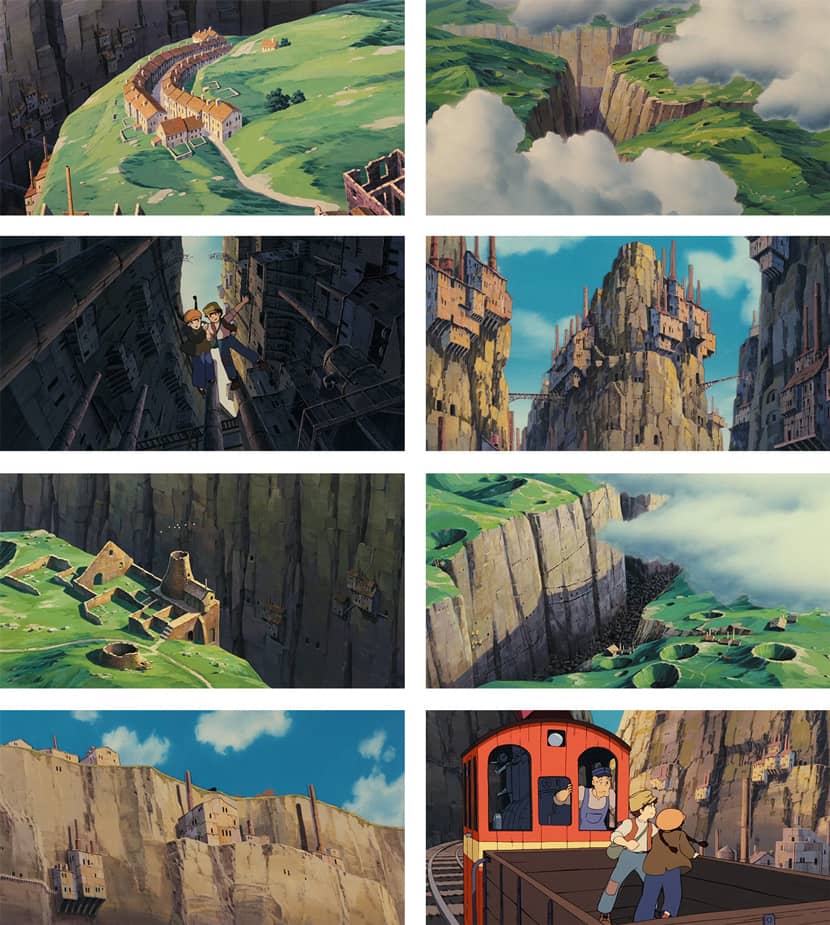
Story.
It is important that there is a story behind each image, to which the image serves as a narrator - so here is the story behind my image:
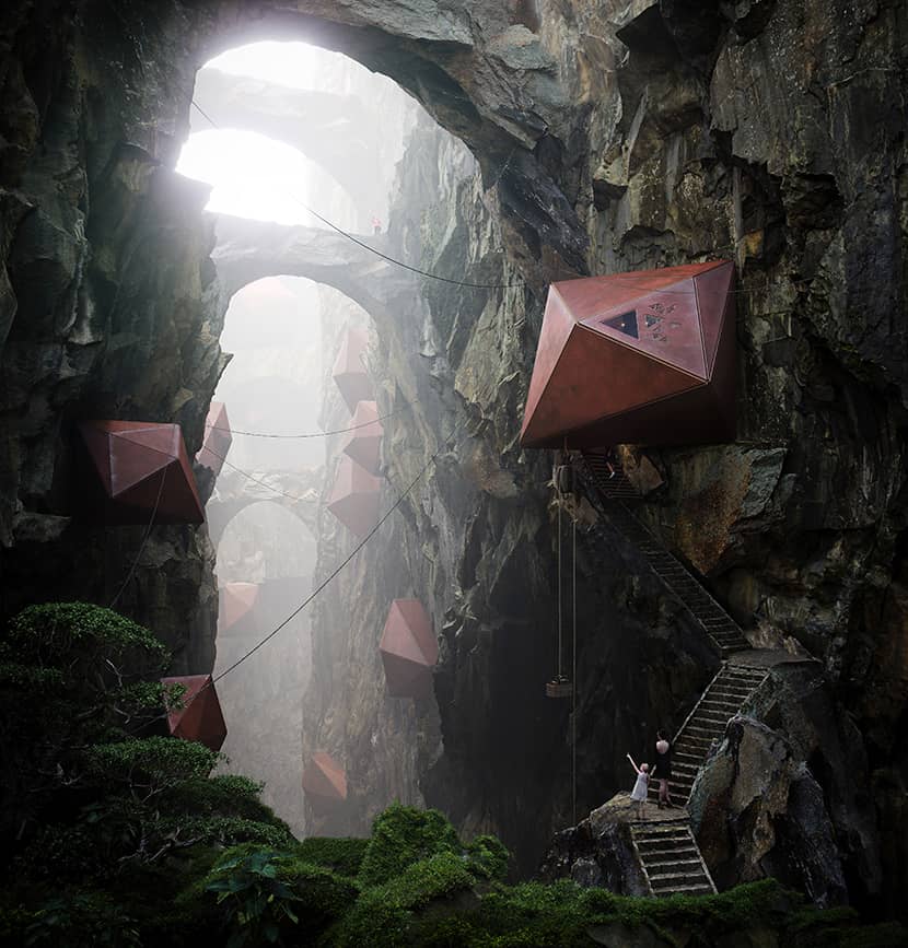
“The warm winds of Cliff Valley have always been said to have a healing effect on the soul of the digital nomad. Most possibly because of the unique combination of local conditions. Proximity to the sleeping volcano, as well as the humid climate of the warm ocean’s breeze, mixed with vapours from geothermal cavities and topped with its unique position within the geomagnetic field of the planet, creates a holy grail of cellular regeneration. No surprise that this highly sought-after location was the birthplace of a spiritual enclave focused on human well-being. The same enclave also commissioned this project with the following brief: Structures must be reminiscent of crystalline harbours nestled within the rugged surface of the cliffs. Access is rewarded after passing through the purgatory of gusts of heavy geothermal vapours, being violently stirred by salty coastal winds. Once visitors reach their destination, they will become one with the mountain and heal.”
Draft.
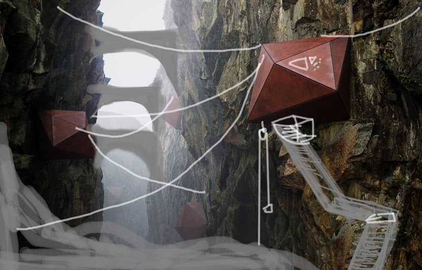
Usually, I start with a simple block-out and then I take the image to PS to do a very rough sketch to lay out the main elements to be added. This is the initial stage where things may change quickly - aspect ratio, organisation of elements, camera angle etc. But the underlying idea will prevail.
Once my heart is happy with it, I start to play with the mood, lighting, materials, adding more detail…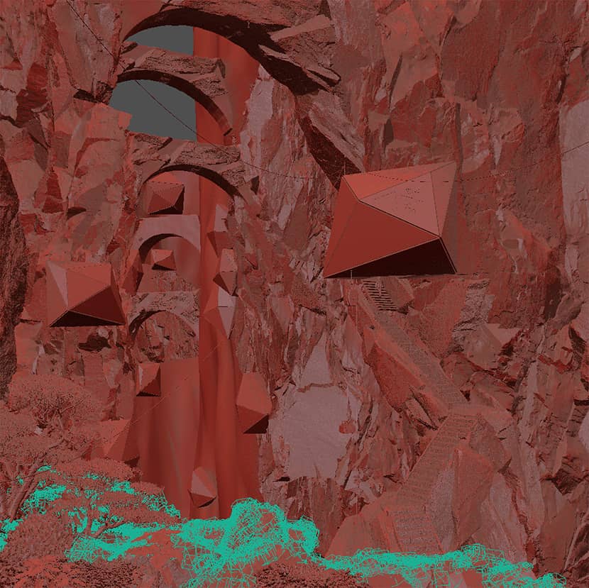
Composition.
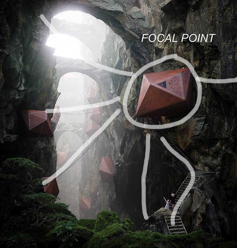
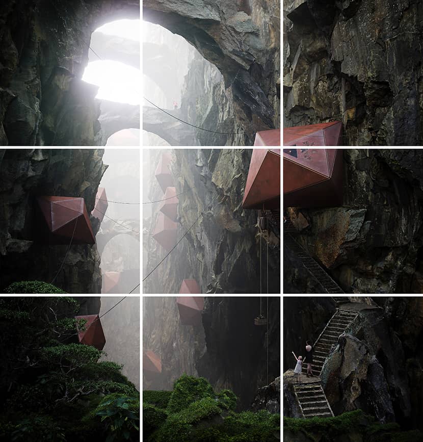
I prefer not to overcomplicate the composition approach - just rules of thirds and proper separation of foreground, midground and background is sufficient for most images. Making sure that viewers will focus on what we want them to can help to reinforce the story.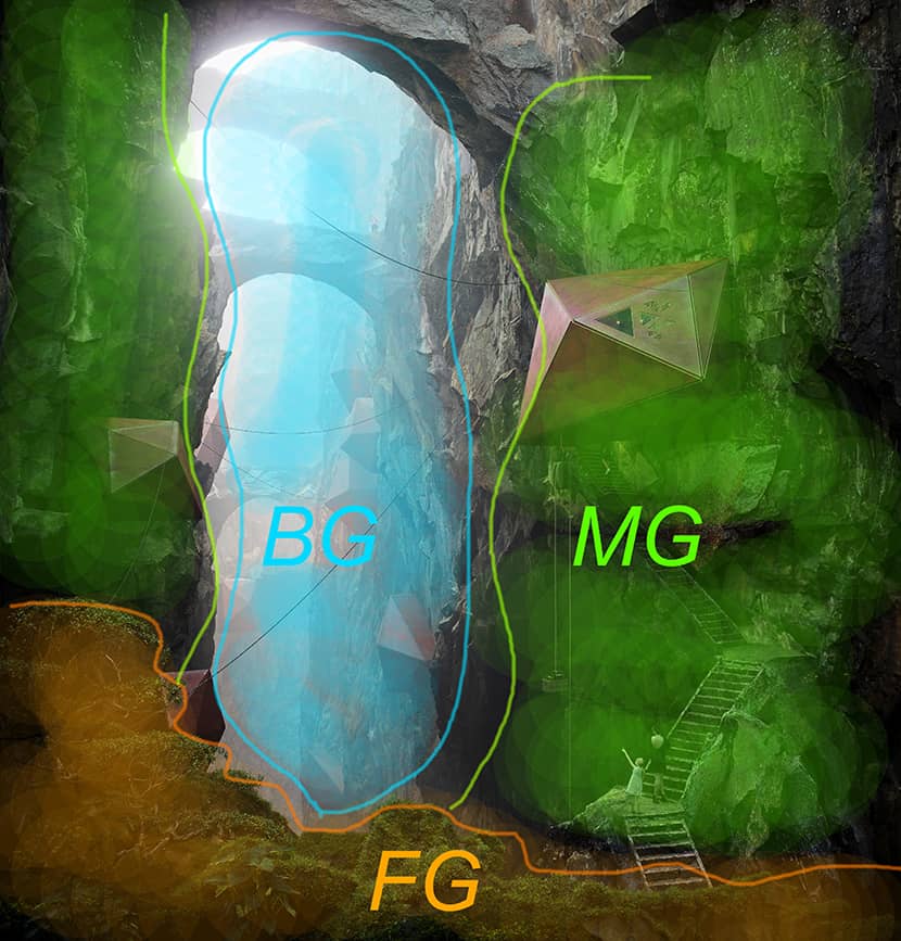
Materials.
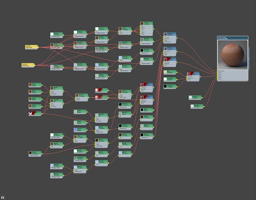
I prefer not to overcomplicate the composition approach - just rules of thirds and proper separation of foreground, midground and background is sufficient for most images. Making sure that viewers will focus on what we want them to can help to reinforce the story.
Lighting.
A thick, moody atmosphere that can be almost cut and served to be touched is my goal when I set up the lighting. This time, I decided to follow the industry trend and create several setups from the same camera. I think all of these scenarios can stand on their own and demonstrate a unique feel. 2 views (overcast and evening) used HDRis from Chaos Cosmos and 3DCollective and the sunset and day versions since the direction of light had to be more carefully curated using sun and sky.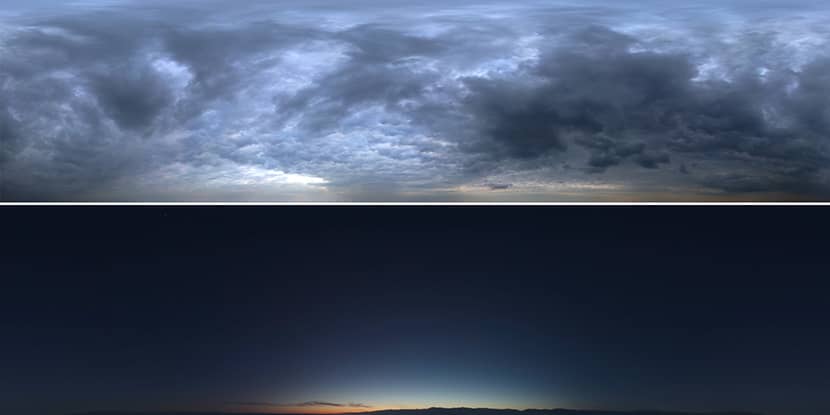
Post-Production.
Final postproduction is to grade up the image in terms of shadows/highlights and also to mask out problematic areas - it is much faster to clone-stamp a few errors in how the rocks connect rather than having to distort the rocks in 3D! Be smart about what you do in 3D and what in 2D - if there is no need, don’t waste time, it is your most valuable resource!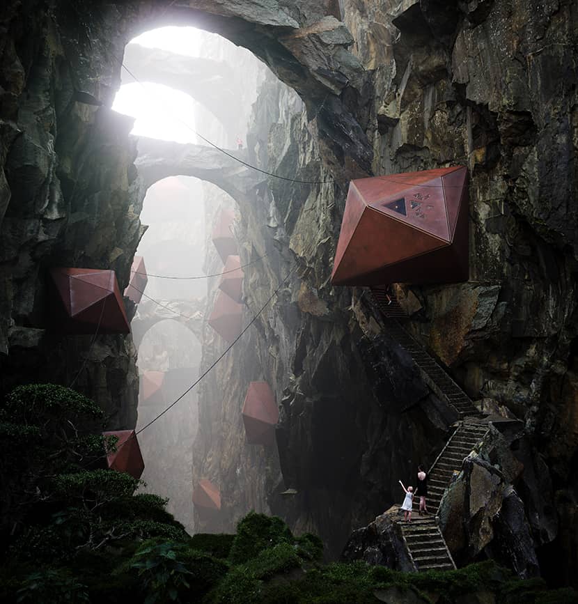

Variation.
SUNSET.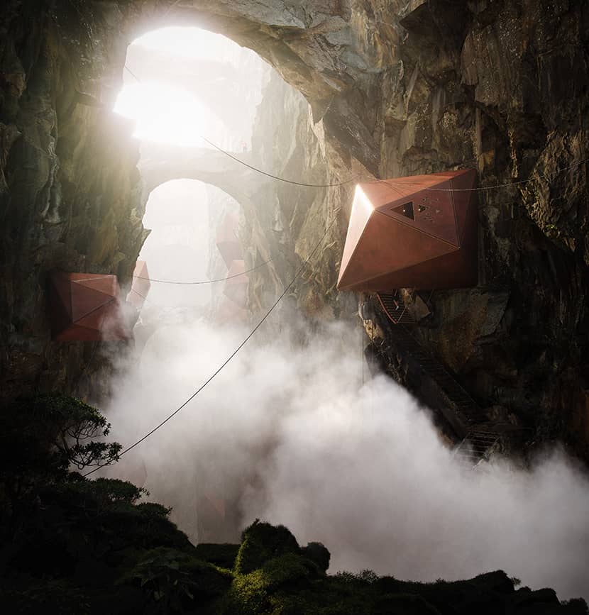
OVERCAST.
EVENING.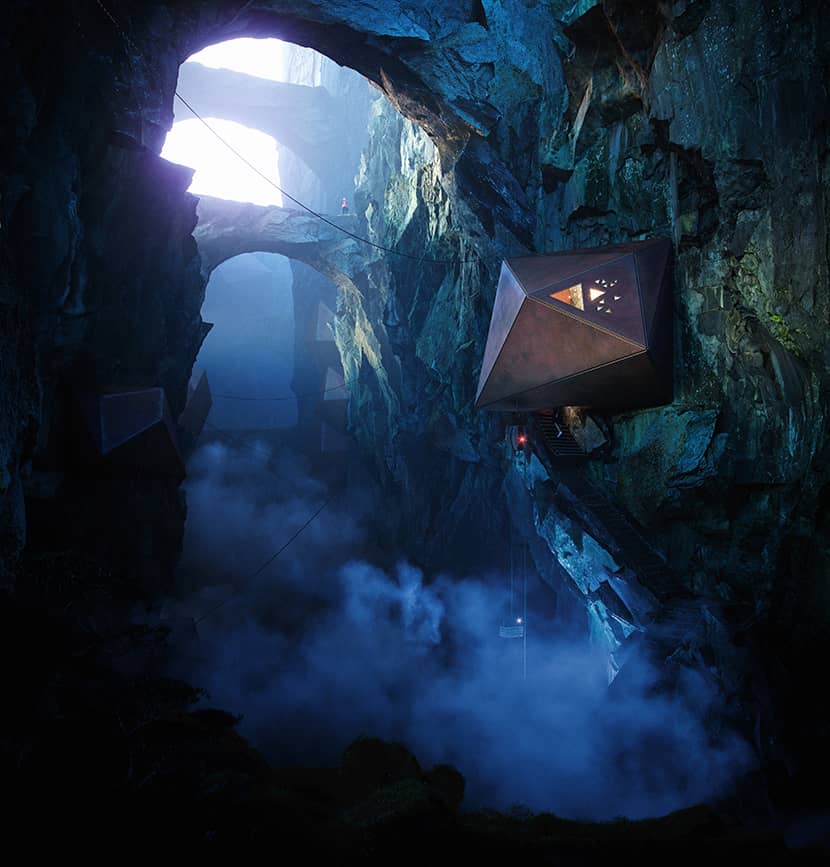
SUNNY.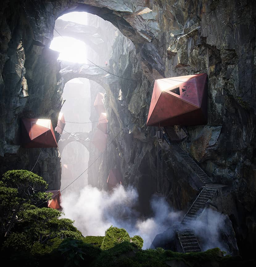
Kind regards,
Matej Hosek.
Check more of Matej's work on these channels:
Want to share your work with our community too?
Contact us at 该邮件地址已受到反垃圾邮件插件保护。要显示它需要在浏览器中启用 JavaScript。 and tell us about your favorite project.

