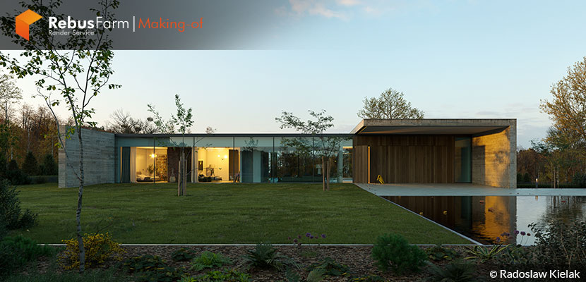
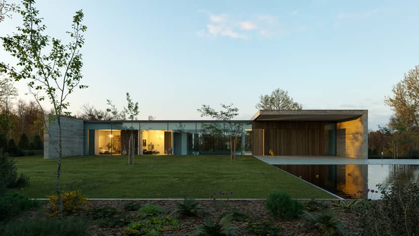
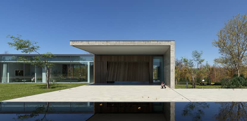
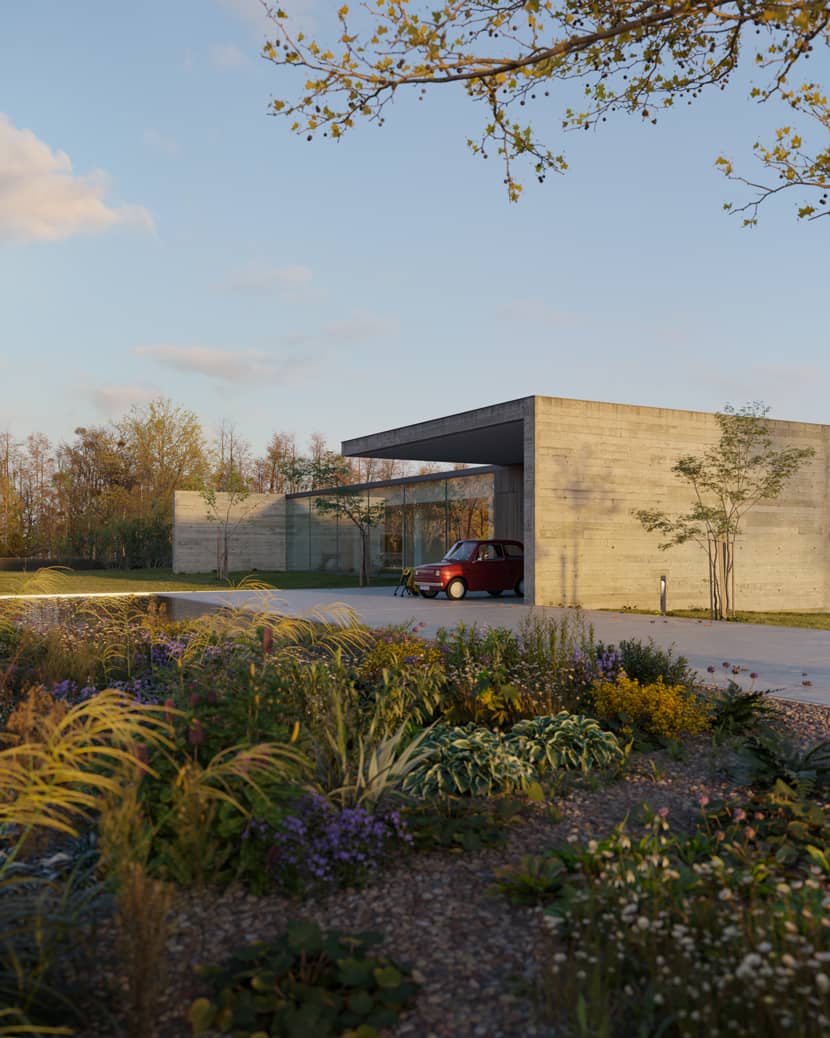
The Modernist Villa is one of the most beautiful ArchViz projects we've recently seen. The amount of photorealism is enormous and the photographic approach is enjoyable. If you want to learn great tips about how you can achieve such an amazing result, visit the article and enjoy whatever Radosław Kielak generously offers. Enjoy!
About me.
Hi there,
I'm Radosław Kielak, and I have been working in the 3D industry for the past decade. I currently reside in the charming city of Lublin, Poland, where I came to study. I am proud to have earned a degree in Landscape Architecture, which has greatly influenced my work in 3D visualization. I have always been fascinated with how architecture can impact and enhance our natural surroundings, and I enjoy exploring these themes in my work in PICTURA studio.
Now, I was given the opportunity to prepare the making-of article for the "Modernist Villa" project for Rebus Farm and VWArtclub. It is an honor to be able to share my knowledge and expertise with others in the industry, and I hope that my insights will be helpful to those who view the content.
Software Used.
For the Modernist Villa project, I utilized a variety of software. Cinema 4D served as the primary work environment. In the matter of realism, I relied on the Corona Renderer engine. Full list of used software below:
Foundry Modo – modeling
Cinema 4d – primary work environment
Corona Renderer – rendering
Surface Spread – scattering plugin (This plugin is similar to the popular iToo Forest plugin)
Adobe Photoshop – post-production
Magic Select – plugin to randomly select polygons
Stcatter It – Darstellungsar – part of the Meadow Asset plugin to create realistic terrain for scattering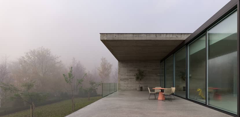
Personal Projects.
The main goal of my work is to recreate the aesthetic of good architectural photography. It is a deliberate limitation that I treat as a stage in my professional development. Personal projects are an opportunity for me to test technical issues in favorable circumstances. The genesis of the Modernist Villa project is a consequence of my affinity for modernism and minimalism aesthetics. The project is based on the great Residence KDP design by Govaert & Vanhoutte Architects. I kept the building's shape intact, while the exterior and interior design were my own ideas.
During the creation of the project, the modeling process was as straightforward as the building itself, so I won't go into much detail about it. Instead, my main focus in this making-off will be on cropping and recreating the mood.
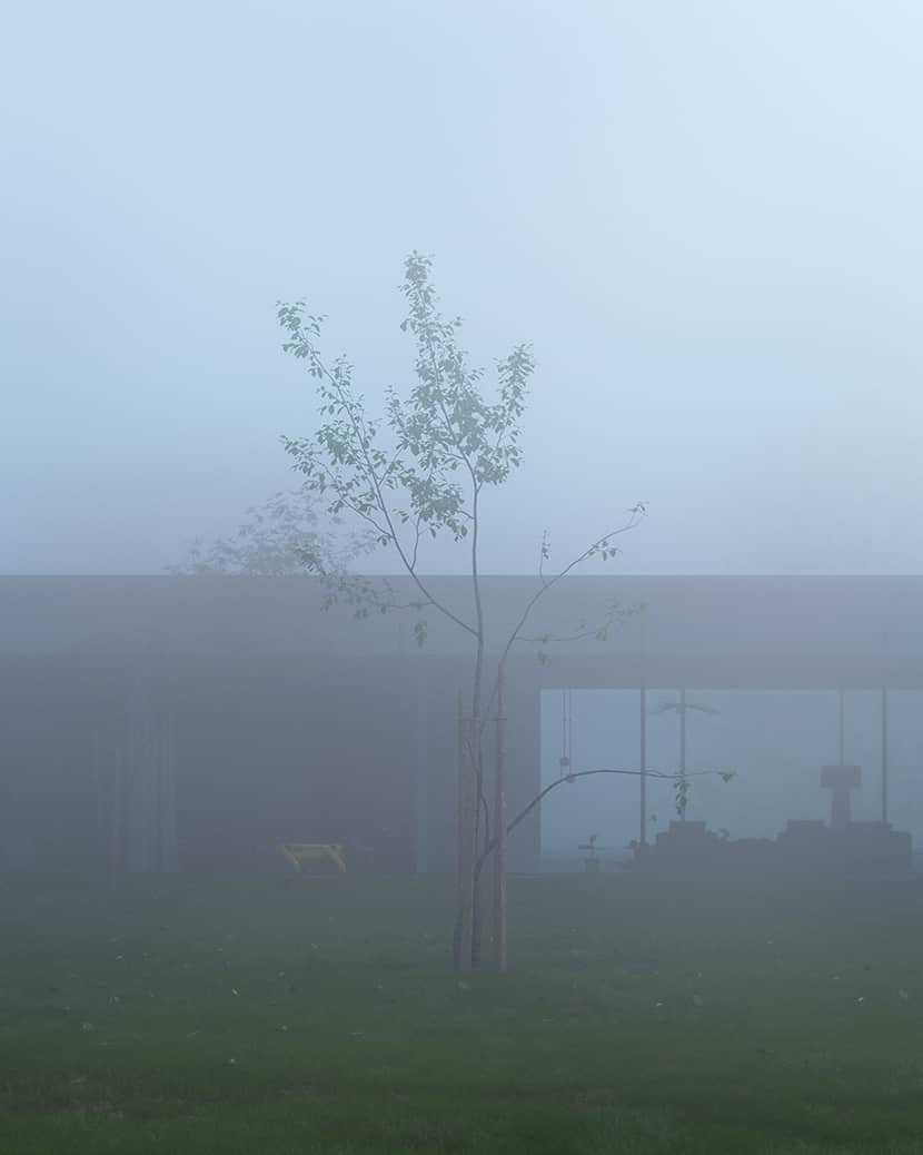
References.
If the goal is to recreate architectural photography, a good starting point is to gather a good set of reference images to see how materials behave in real-life lighting conditions and what colors the greenery takes on. It can help to ensure that the final images accurately represent the intended aesthetic.
Lighting.
In my opinion, the best way to immerse the viewer into the atmosphere of the image is by working with the lighting. It can make or break the final visualization, and it is a critical component that often goes unnoticed when done well. In the Modernist villa project, I used two notable sources of high-quality HDRs, 3D Collective and PG SKies, to create the desired atmosphere. One of the images was lit using the Corona Sun+Sky system.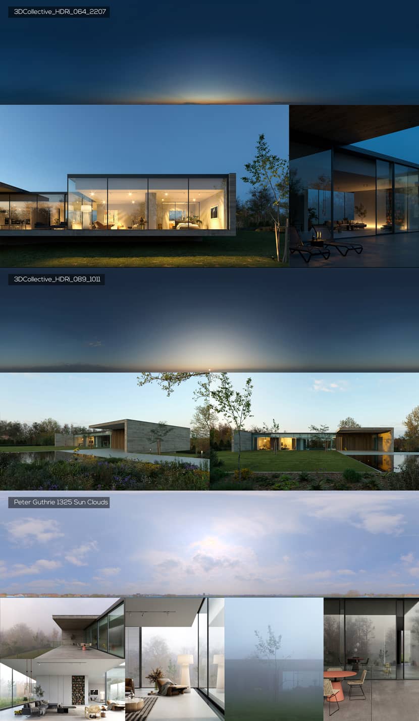
Weather Conditions.
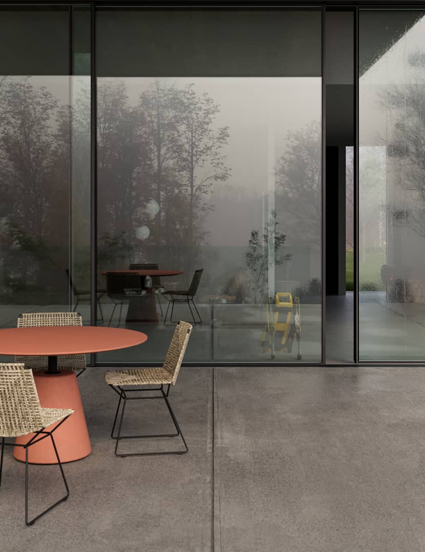
During my project, I explored weather conditions such as fog and rain. It's important to note that fog can be heavy and block out all sunlight in a scene, which can greatly affect the mood and atmosphere of the image. Additionally, fog can be localized to certain parts of the scene or limited to the background, providing depth and adding interest to the composition. The fog effect was applied even in the interior shots to limit the visibility of the background.
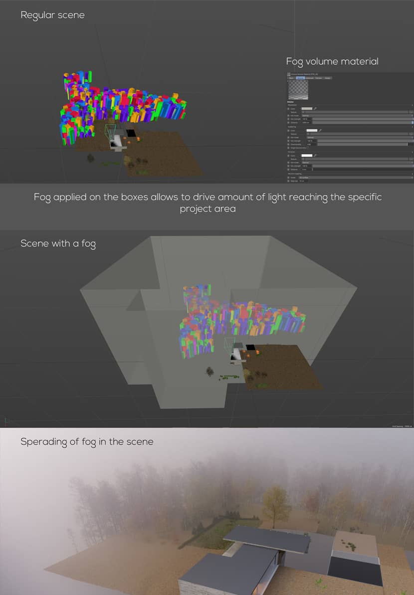
In the Modernist Villa project, I attempted to achieve a wetness or after-the-rain effect in two ways. Firstly, I edited the specular/roughness channels in specific areas to create a more realistic look. Secondly, I added water drops by using a water drop texture from textures.com and applied it on top of specific elements.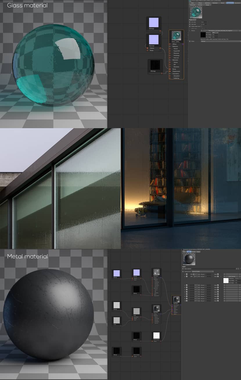
CLICK TO ENLARGE THE IMAGE.
Here are some clay renders to present lighting and fog effects isolated from the color data.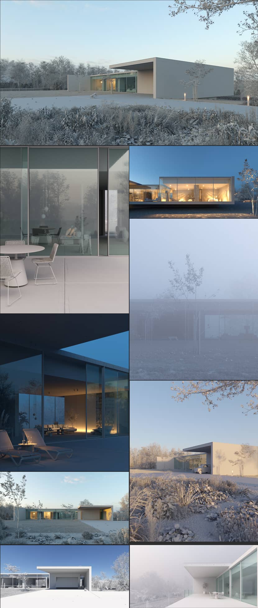
Textures.
In my workflow I have found that the textures.com textures are among the most accurate I have come across. It behaves well in terms of tiling and displacement reaction. So most important material in the scene – facade concrete is one of their scanned textures. I have incorporated also Quixel Megascan textures as another source of good-looking materials. Overall materials in my scene are relatively simple. Some of them become more complex by using the Corona distance shader to apply parametric abrasion on the edges of certain elements.
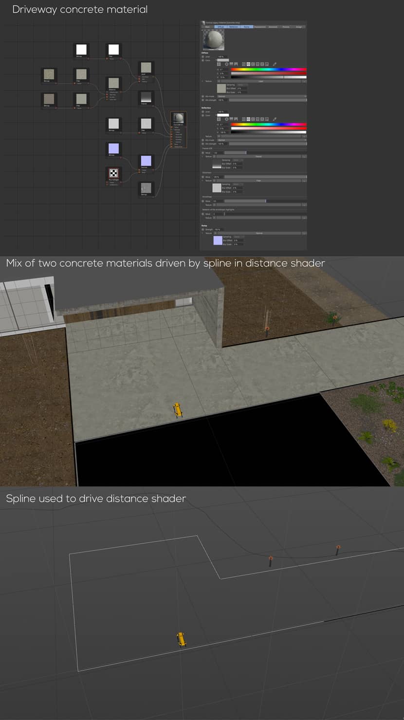
CLICK TO ENLARGE THE IMAGE.
Framing.
In my personal experience, framing has been the most challenging stage in architectural visualization, particularly when capturing large buildings from a close distance. However, I found that working with a modernist villa provided great relief from such situations. The scale of one or two-story buildings and a large surrounding area can be a great playground for compositing. I often use the classic 9-field section or divide it by half to construct most of my frames. However, when dealing with minimal architecture, simplicity in framing seems to be the most effective approach.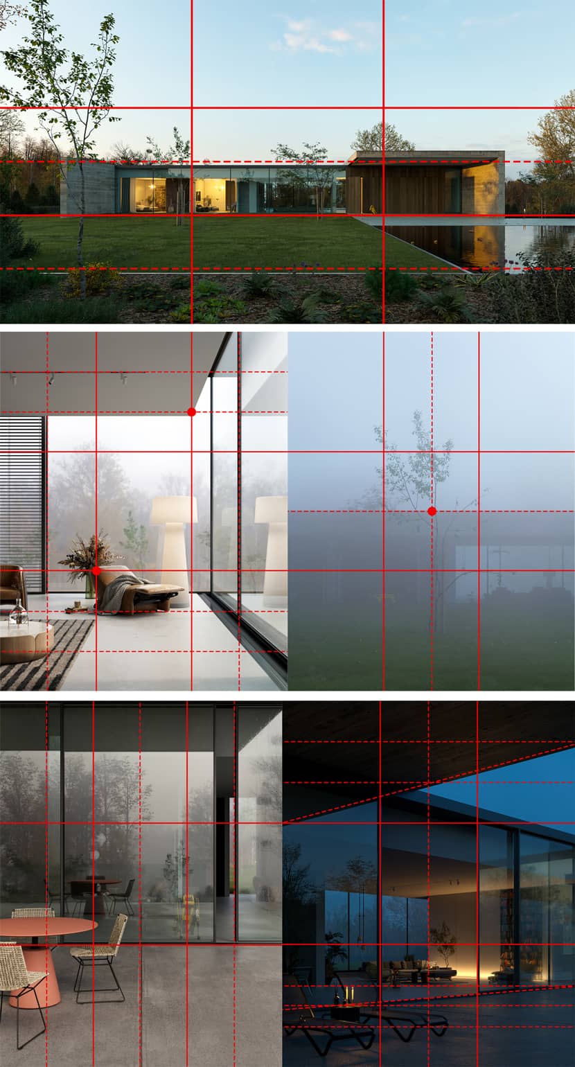
Assets.
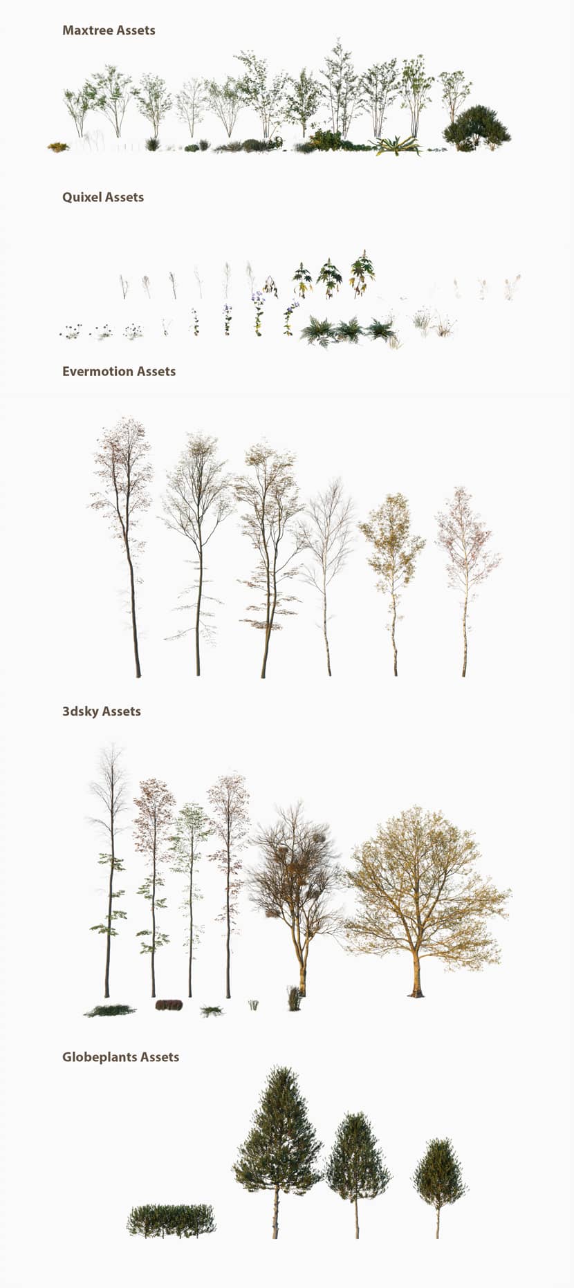
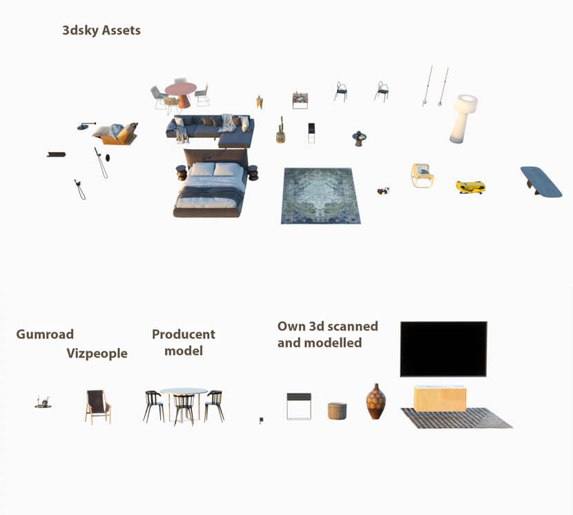
In today's world of ArchViz, it's becoming more common to use purchased assets in scenes. While some may see this as taking shortcuts, it allows us to focus on the important aspects of creating a scene - lighting, composition, and mood. My workflow involves collecting high-quality models, tweaking them to my needs, and creating sets that are ready to use. With a library of models, lighting, and materials, I can quickly create scenes that represent sunny spring days, cheerful warm autumns, or cold winter weather. This approach has been successful for me in both personal and commercial projects.
And here are some examples of tweaking assets to my needs.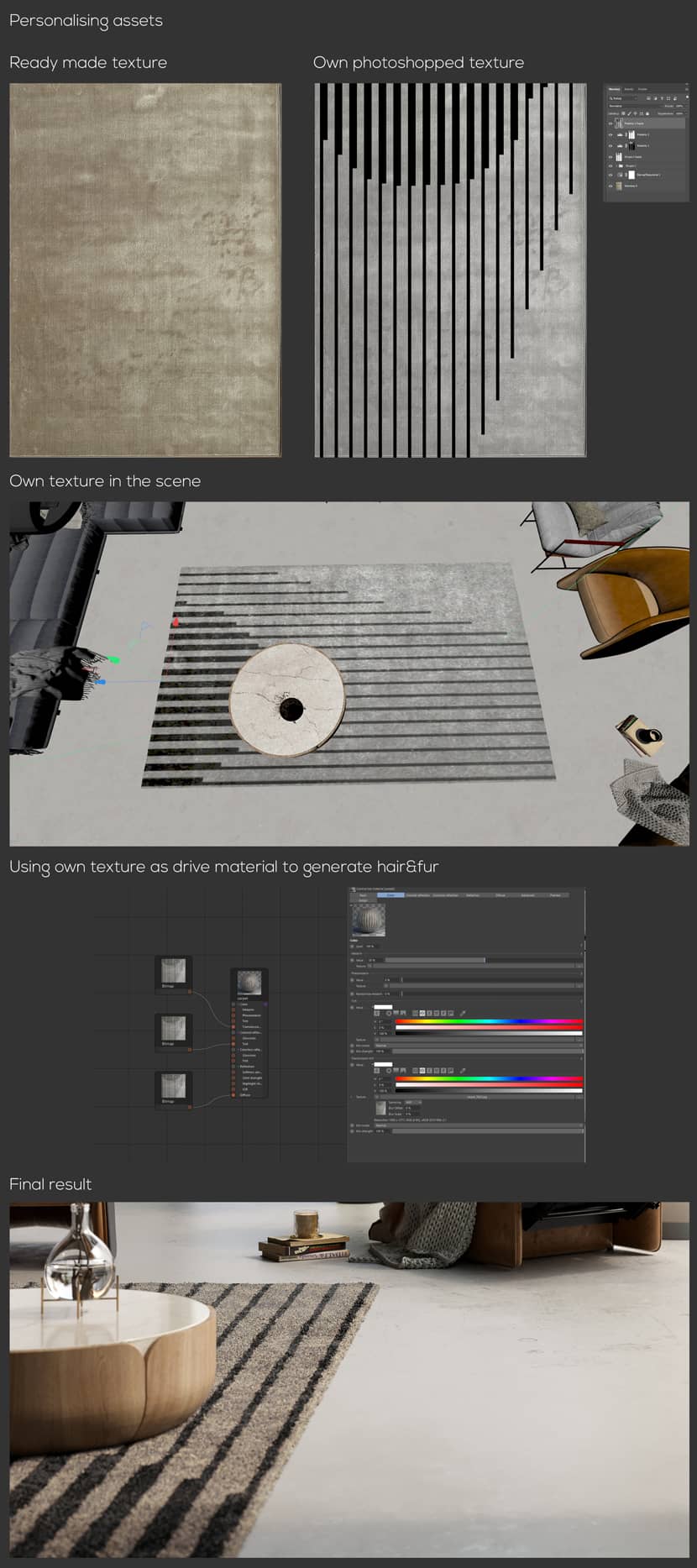
CLICK TO ENLARGE THE IMAGE.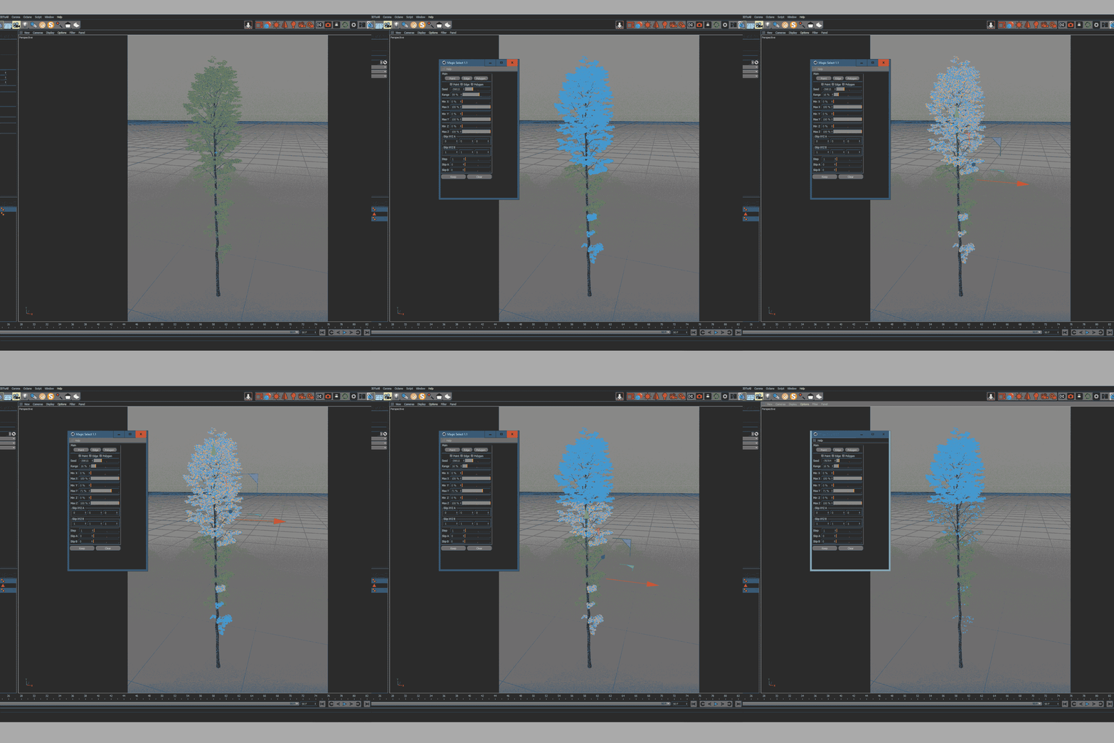
CLICK TO ENLARGE THE IMAGE.
Regardless of what was said, I also include some of my own photogrammetry scans in my scenes. This adds unique and personal touches to my work while also commercializing the time between projects. It's all about finding the right balance between efficiency and personalization.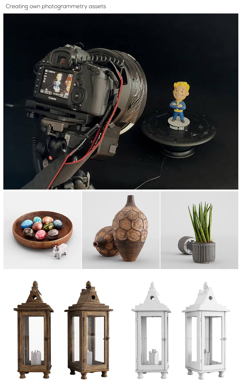
Post-Production.
Most of the images in the Modernist Villa project were created with minimal post-production. Only small adjustments were made in Camera RAW and a combination of translucency and reflection channels were used. The stamp tool rescued me also. For the night-time renders, I used small LightMixer variations to mimic the professional photography workflow. The largest post-production manipulation was adding the clouds in the scene lit by the Corona light system.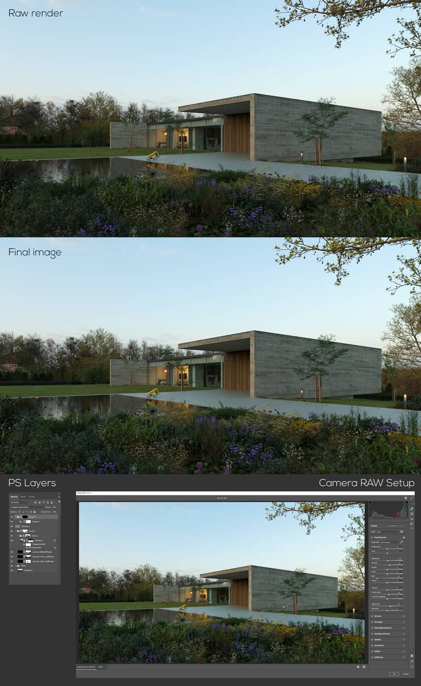
CLICK TO ENLARGE THE IMAGE.
Final Images.
Thank you for taking the time to learn a bit about me and my work. Keep rendering and let's express architecture!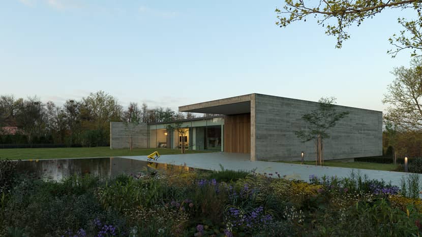

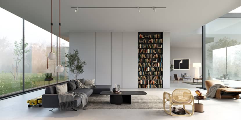
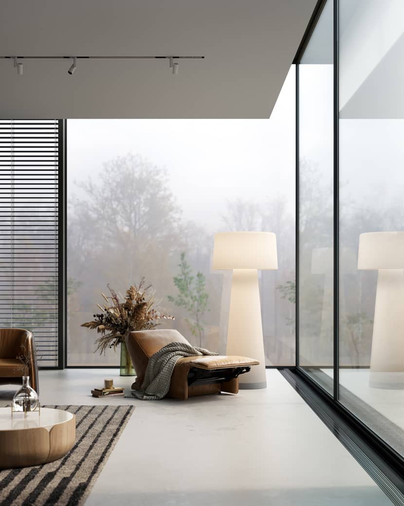

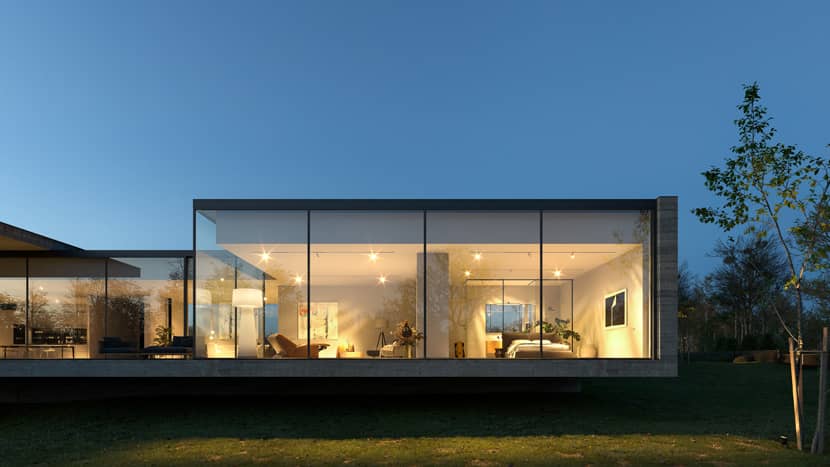
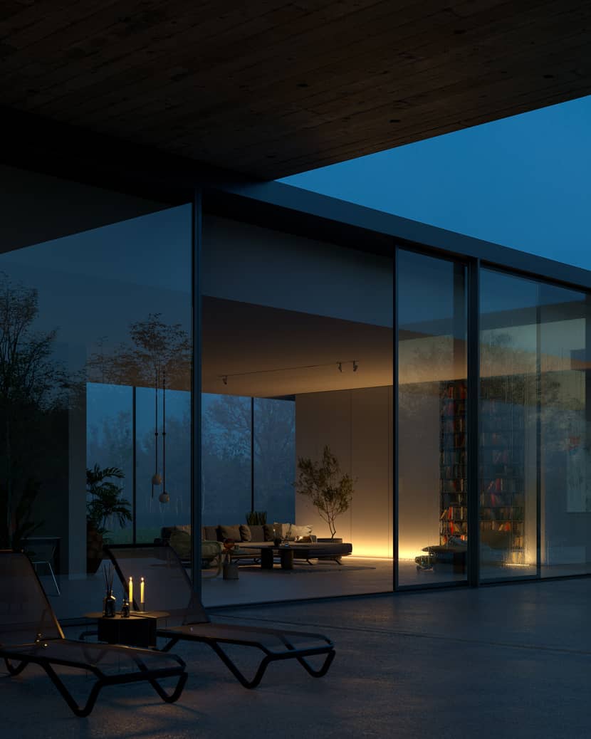
Kind regards,
Radoslaw Kielak.
Check more of Radoslaw's work on these channels:
Want to share your work with our community too?
Contact us at 该邮件地址已受到反垃圾邮件插件保护。要显示它需要在浏览器中启用 JavaScript。 and tell us about your favorite project.

