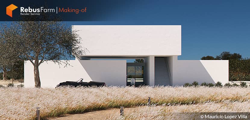
As we use to say, "inspiration can be found everywhere" and once again we realized it reading that Mauricio inspired this beautiful project based on o poem written by his mother. Check his well-written making-of article and learn more about his workflow.
About me.
Hi, everyone!
I would like to thank the Rebusfarm team for inviting me to prepare this making-of article, as well as extend a big greeting to the entire community of 3d creatives.
My name is Mauricio Lopez Villa, I am 26 years old and I am a Colombian architect from the city of Bogota. After finishing my architecture degree, I worked for 3 years as a landscape designer and 2 years as an interior designer. At the same time, while working, I started to study 3D. Here I found a way to combine my passions, nature, design, and technology. Thus, the creation of digital content became my job and hobby.
Software Used.
The work tools that I always use for my projects are 3ds Max, Corona Renderer, and Adobe Photoshop. I am currently dedicated to product and architecture visualization with my work team at Dulce In Piro. I hope this article is to the liking of all readers and that some of the steps that were followed for the elaboration of "Villa Poiet" are useful to you.
The Project.
"Villa Poiet" is one of the most special projects I have done because it is a tribute to a poem written by my mother, here is an excerpt....
“Intuit your path to fulfillment, daydreaming the lights and backlights of time that seem to stop when you're happy. Mutual symbiosis, a generator of propitious atmospheres that discover the memory of the evocative blue landscape, the green fronds, and the air that expands your soul, to translate them into the sublime experience, of the exact desire of your senses. A final search of instinct, with a well-understood reason profile.”
– Mariela Villa Ospino
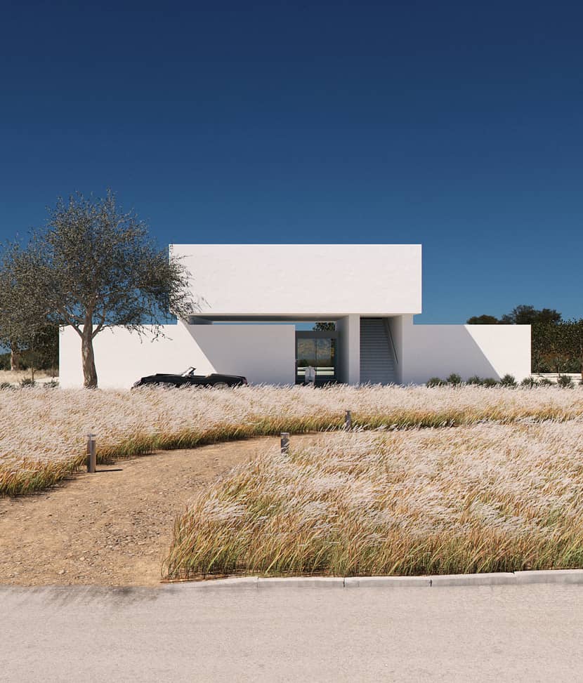
In general, the perception of the project deals with a Mediterranean Villa scene, with warm weather and where the wind has just left a trace in the vegetation.
Additionally, it was a project that helped me to rediscover after several years that visualization does not have to be a complicated process, neither conceptually nor technically speaking, inspiration comes from the most beautiful things in life and from the tools we must take advantage of the potential of the basics.
A. Architectural concept.
"Pure lines playing on a blue milori deep background, with an open sky, adventurously flat, impressive and enriching that highlights the composition of angles that point and wink at simplicity."
The architecture of Villa Poiet is defined formally by lines and tones that fit the landscape, and spatially by the separation of 2 volumes where one floats above the other. It is a two-story house with a social area on the first floor and an independent habitational area on the second floor. It seeks that the relationship with nature depends on exploring, to experience the distant and near landscape of the project we must go out, and see the sky, and look up.
B. References
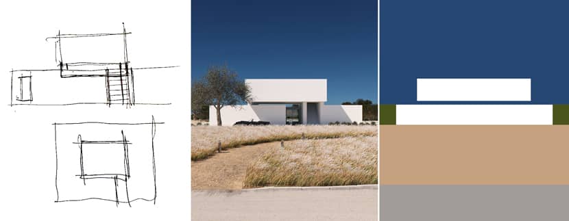
Along with the search for references I created a collage with Mediterranean country villas that presented similar situations where I was able to analyze the 5 aspects that I considered most important of the project.
1. The behavior of the materials of the architecture with the direct incidence of the sun.
2. The color of the sky
3. The colors of the vegetation
4. The shadows
5. Photographic composition
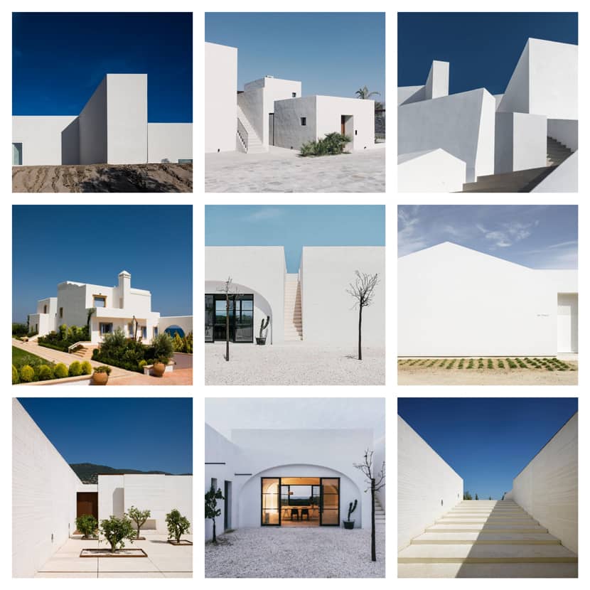
Modeling.
The modeling of Villa Point is very simple, the native 3DS Max tools were used for the creation of walls, windows, and stairs, they are really very complete and easy to use. An important detail that I let pass in my projects some years ago is the Unwrap UVW modifier that this time was used for the material of the dirt road to adapt to the directionality of the object, it adds a lot to the realism of the images.
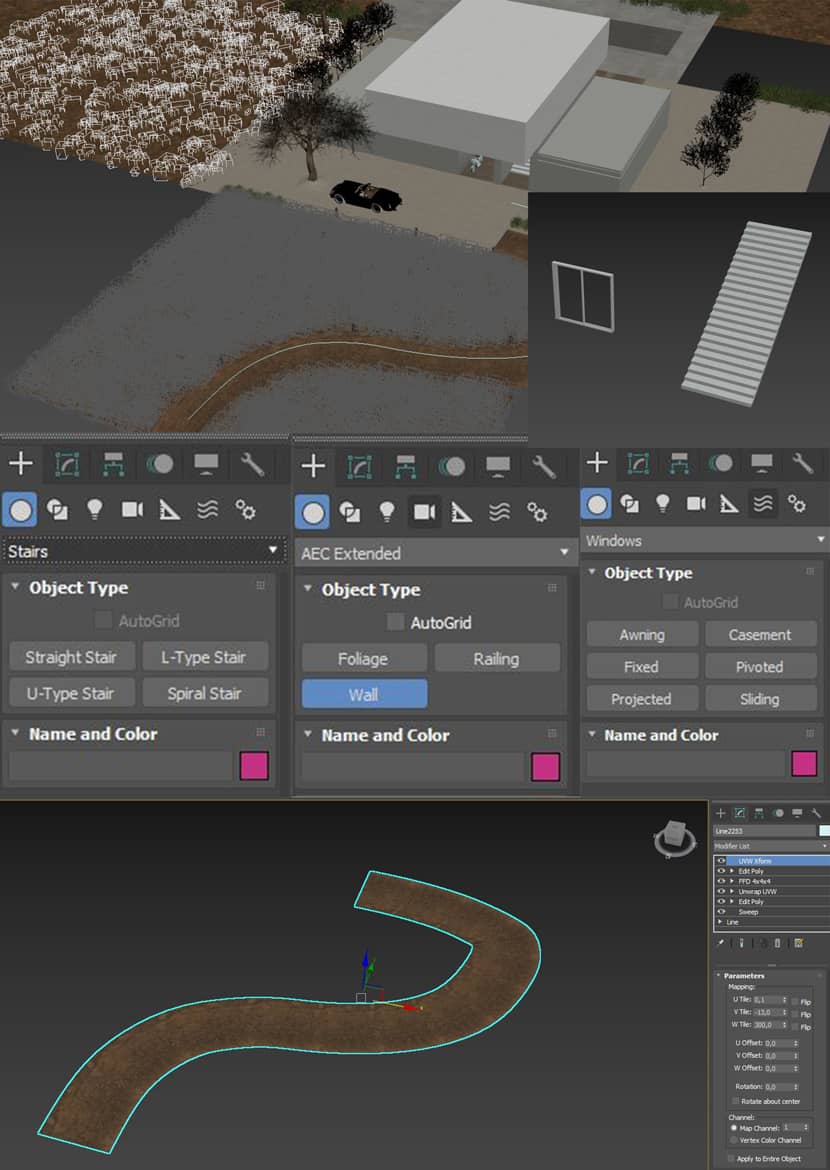 Click on the image to enlarge.
I drop below a nice tutorial related to Unwrap UVW:
Lighting.
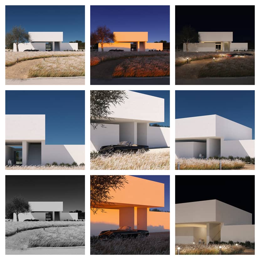
Lighting is one of my favorite segments in all the projects I elaborate on, and for Villa Poiet I created 3 moments of the day, in each one I made a scene to show the different ways and settings used, it was a great exercise of personal experimentation where I want to highlight the powerful tool that is the physical sky of Corona renderer + Corona sun.
A. Daylight.
I want to emphasize that the type of lighting to which I have dedicated more time to achieve a realistic result has been daylight, in this case, what I do is, use for the lighting map the physical sky of Corona renderer combined with Corona sun of intensity between 1.3 and 1.75. Here it was 1.5 and size 1 to obtain sharp and powerful shadows that contrast with the white of the architecture and give the traditional warm feeling of the Mediterranean climate. On exteriors, I like to complement the lighting with an HDRI map in the Direct visibility override tab because we can show a background that matches our lighting without the need to model it. The HDRI used was downloaded for free at Polyhaven.com.

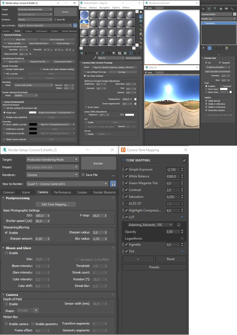 Click on the image to enlarge it.
B. Sunset.
The sunset lighting in this project is one of my favorites, as it was the one I wanted to awaken more sensations, for this reason, a sun at a low altitude that created a gradient of orange and a purple sky was the choice. Intense colors connected the morning and were the curtain of the evening. Again the physical sky of the Corona Renderer combined with the Corona sun with the protagonists, however, with different settings, in the case of the HDRI map, the most drastic change happens in the HUE option.
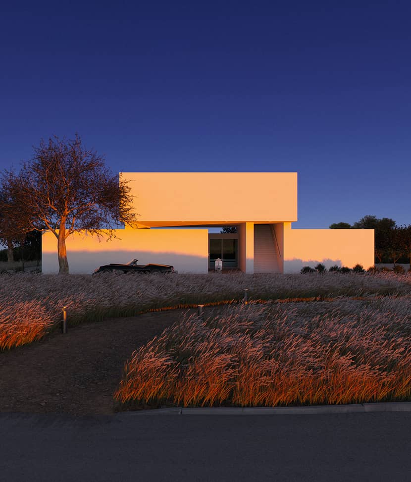
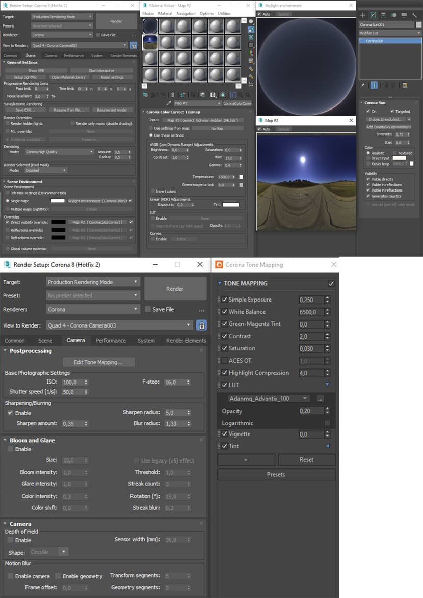 Click on the image to enlarge it.
C. Night
Finally the night, the moment when the soft light of the moon covers the project, our sky becomes completely dark and the warm artificial light marks the way for the car coming home, this image shows the power of the white when it is influenced by several light sources. The lighting settings at this time of day are different, now the HDRI maps appear to illuminate the scene, and the new HDRI used is also from Polyhaven.
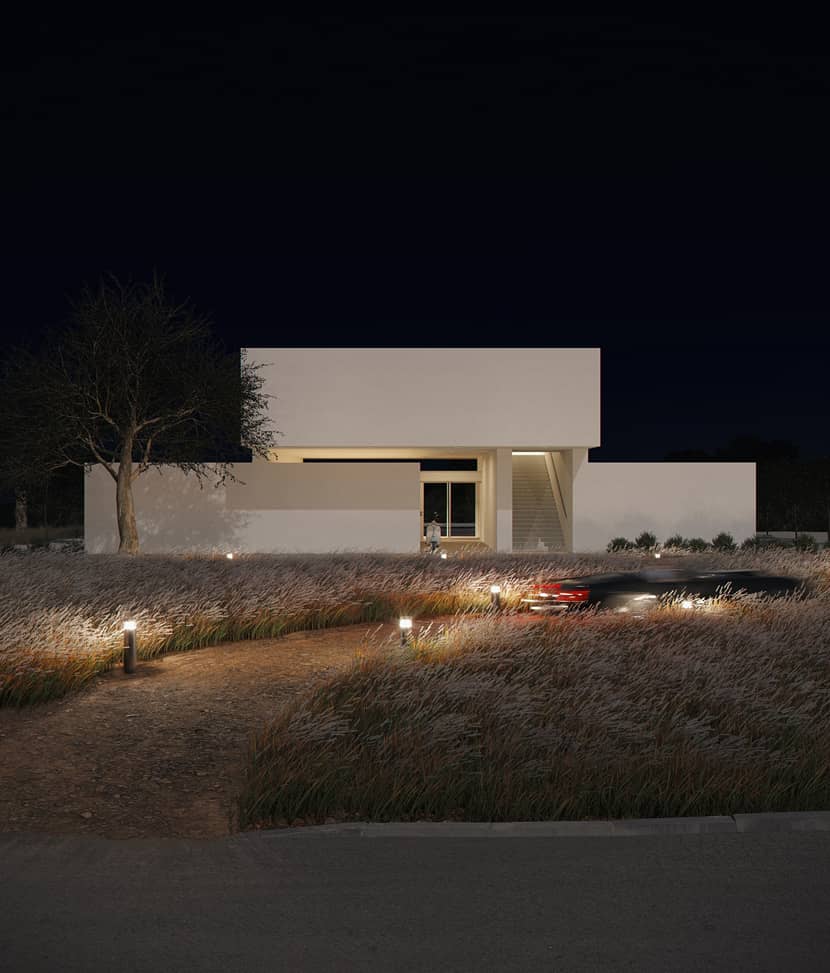
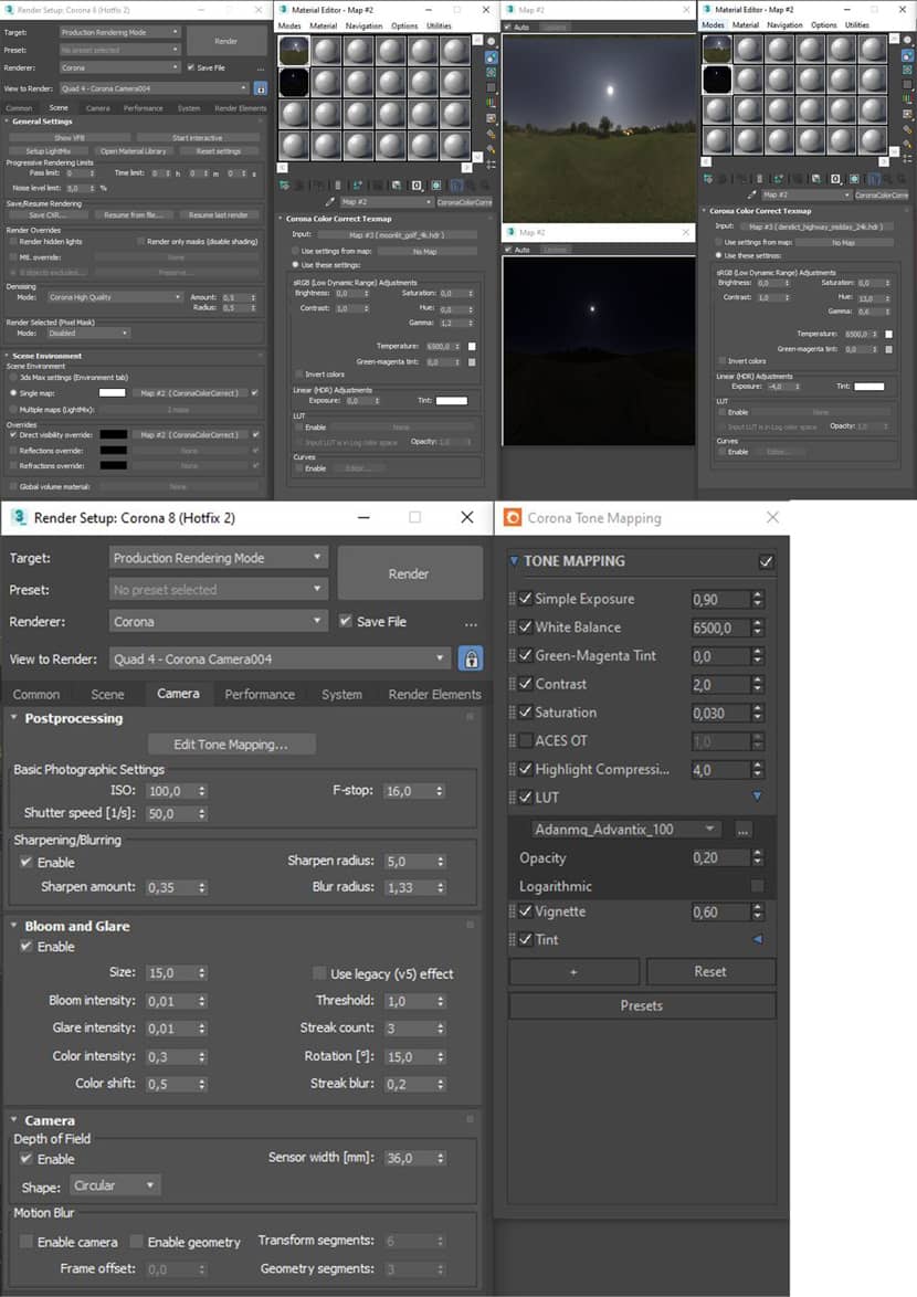 Click on the image to enlarge it.
Textures & Assets.
For the textures I used resources from Megascans that I later edited, I usually complement the textures with composite maps to add layer masks of dirt and imperfections on the edges of the objects where the textures are applied.
For the bushes and grasses, I used models from the Maxtree libraries, edited to reduce the reflection and translucence of some of the leaves. For the tall grasses, I chose models that gave the sensation that the wind had just passed and they appeared leaning, that's part of the freshness I wanted the images to have.
The larger models in the scene, which correspond to the traditional touches that would give context to the project, the classic motorcycle, the olive tree, and the convertible car are resources purchased from cgmood.com and edited later.
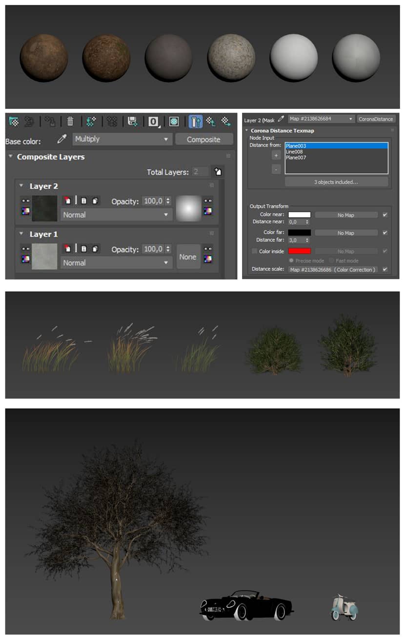 Click on the image to enlarge it.
Composition & Camera.
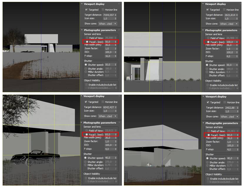
In the photographic compositions of exterior images, I usually use the rule of thirds and symmetries, in addition to seeking balance with the negative within the frame.
The lens I use usually ranges between 50mm and 120mm because I personally consider that they are the ones that maintain the silhouette of the project without major distortion.
 Click on the image to enlarge it.
Post-Production & Result.
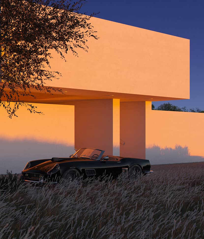
The post-production process of the images is very simple, I don't take more than 4-5 minutes per image, as I always try to get the best possible result from the render engine.
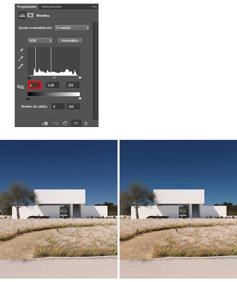
In Photoshop I adjust the input level of the shadows to increase a little the intensity of the dark areas (between 5-10) and I add some lut that does not exceed 15% opacity to strengthen the feeling sought in the concept of the project.
The left image is without post-production.
Conclusion.
Thank you very much for reading this article and my recommendation is that we always do 3D with joy, special greetings from Colombia!
With kind regards,
Mauricio Lopez Villa.
Check more of Mauricio's work on these channels:
Want to share your work with our community too?
Contact us at 该邮件地址已受到反垃圾邮件插件保护。要显示它需要在浏览器中启用 JavaScript。 and tell us about your favorite project.

